Survey graphs: How to visualize your survey results effectively
Learn which chart types to use to make your survey data clear and actionable.
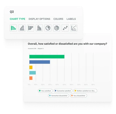
Have you ever spent time gathering valuable survey data, only to have your insights overlooked because the results were presented in a cluttered or confusing way?
Unfortunately, unclear data visualization can lead to ignored results and missed opportunities. Survey graphs are the essential tool for transforming raw data into clear, compelling stories that drive action.
The main challenge with using charts is selecting the correct type from the wide variety available. Many people do not understand the strengths and weaknesses that come with survey chart types, either deciding off the cuff which looks the nicest or staying in their comfort zone by overloading their report with pie or vertical bar charts.
This article will guide you through the process of choosing the right chart for your data, helping you to create visuals that not only inform but also inspire your audience.
What is a survey graph?
A survey graph is a visual representation of the data collected from a survey. It is used to present complex information in a simple, easy-to-understand format, making it possible to identify trends, compare results, and communicate findings effectively to an audience.
Common examples of survey graphs include vertical bar charts, pie charts, line graphs, and histograms, each serving a unique purpose in data visualization.
The right graph can make the difference between a report that sits on a desk and one that leads to a strategic decision. Turning survey data into presentations ensures your insights are not just seen, but truly understood.
Visualizing survey results with vertical bar charts
A vertical bar chart, also known as a column chart, uses vertical bars to show comparisons between different categories. The height of each bar corresponds to the value it represents.
Uses
Vertical bar charts are best for comparing the means or percentages of 2 to 7 different, mutually exclusive groups. They are ideal for showing how a specific metric, such as satisfaction or frequency, varies across a small number of distinct categories.
How to create a vertical bar chart
- Start with a categorical and a numerical variable. For example, to compare satisfaction ratings (numerical value) across different demographics (categories like age groups or genders).
- Plot each category as a separate bar. The different demographics would be placed along the horizontal axis.
- Use the numerical value to determine the height of each bar. The height of each bar would correspond to the average satisfaction rating for that demographic.
Best practices
- Keep the number of categories small (2-7) to prevent clutter.
- Label your axes clearly to indicate what is being measured.
- Use a consistent scale for the numerical axis to avoid misleading the audience.
Using horizontal bar charts for survey data
A horizontal bar chart is similar to a vertical bar chart, but the bars are drawn horizontally. The length of each bar represents the value.
Uses
This type of chart is recommended when comparing the means or percentages of 8 or more different categories. It is particularly useful for rankings or when the category labels are long, as they are easier to read on a horizontal axis.
How to create a horizontal bar chart
- Gather a categorical and a numerical variable.
- Draw each category as a horizontal bar. The length of each bar is determined by the numerical value.
- Place the categories along the vertical axis. This allows for more space to read long labels.
Best practices
- Order the bars by value (either ascending or descending) to make comparisons and rankings easier to interpret.
- Use this chart type when your category labels are lengthy.
- Maintain a consistent scale on the numerical axis.
Visualizing survey data with pie charts
A pie chart is a circular graph divided into slices, where each slice represents a proportional part of the whole.
Uses
Pie charts are best used to illustrate a sample breakdown in a single dimension, showing differences within a group based on one variable. They are most effective when you are showing parts of a whole, such as the percentage of respondents who chose each answer option in a single-select question.
How to create a pie chart
- Ensure your data represents parts of a whole. The values for all categories must add up to 100% of the total.
- Calculate the proportion of each category. This will determine the size of each slice.
- Draw a circle and divide it into slices. Each slice corresponds to a category, with its size accurately representing its proportion of the whole.
Best practices
- Never use a pie chart for more than 5-6 categories, as it becomes difficult to distinguish between the slices.
- Ensure that the categories are mutually exclusive and collectively exhaustive (i.e., they add up to 100%).
- Use labels and percentages directly on the chart to make it easy for the viewer to read.
Displaying survey trends with line charts
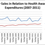
A line chart, or line graph, displays data points connected by straight lines. It is used to show trends or changes over a continuous period of time.
Uses
Line charts are ideal for illustrating trends over time, such as tracking changes in customer satisfaction scores over several months or years. They are also great for comparing two different variables over the same time period.
How to create a line chart
- Choose a continuous variable for the horizontal (x) axis. This is typically a time scale, like dates, weeks, or months.
- Choose a numerical variable for the vertical (y) axis.
- Plot each data point at the intersection of its x and y values.
- Connect the data points with a line to show the progression of the data over time.
Best practices
- Make sure the x-axis is a continuous scale (e.g., dates, weeks, months).
- Avoid using more than 3-4 lines on a single chart to prevent it from becoming cluttered and difficult to read.
- Clearly label each line to represent the variable it is tracking.
Analyzing survey relationships with scatter plots

A scatter plot uses individual data points to represent the values of two different variables. The pattern of these points reveals the relationship or correlation between the variables.
Uses
Scatter plots are used to show how different data points settle around a mean based on two to three different dimensions. They are excellent for identifying correlations between competing variables, such as finding a relationship between customer satisfaction and product usage frequency.
How to create a scatter plot
- Choose two numerical variables. For example, customer satisfaction scores and product usage frequency.
- Create a horizontal (x) and vertical (y) axis. The axes should be labeled with the variables you chose.
- Plot each data point where the two variables intersect.
Best practices
- Use a clear, descriptive title that explains the relationship you are exploring.
- Label both the x and y axes with the variables they represent.
- Look for clusters, outliers, or clear linear patterns to find relationships in your data.
Showing distributions in surveys with histograms
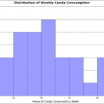
A histogram is a type of bar chart that shows the distribution of a continuous variable. The bars represent ranges of values (bins), and their height indicates the frequency of data points within that range.
Uses
Histograms are used to illustrate distributions on dimensions measured with discrete intervals, where the x-axis is a continuous scale. They are ideal for showing the frequency of numerical data, such as the age ranges of your survey respondents.
How to create a histogram
- Group your continuous data into "bins" or ranges. For example, you might group ages into ranges like 20-29, 30-39,etc.
- Count how many data points fall within each bin. This will be the frequency for that range.
- Create a bar for each bin. The height of the bar corresponds to the frequency you counted in the previous step.
Best practices
- Choose an appropriate number of bins. Too few bins can hide patterns, while too many can make the graph look messy.
- The bars should touch each other, as they represent a continuous range of data.
- The x-axis should be a continuous scale.
Choosing the right survey graph
Choosing the right graph is the final, crucial step in making your survey insights actionable. The table below provides a quick reference to help you match the right visualization to your survey goals:
| Chart type | Best use case | Quick tip |
| Vertical bar chart | Comparing a small number of categories (2-7) | Use for short, clean comparisons. |
| Horizontal bar chart | Comparing a large number of categories (>8) or categories with long names | Order the bars to show rankings. |
| Pie chart | Showing parts of a whole (proportions) | Use for single-dimension breakdowns. |
| Line chart | Displaying trends or changes over time | Ideal for tracking metrics over time. |
| Scatter plot | Identifying relationships between two variables | Look for correlations and clusters. |
| Histogram | Showing the distribution of numerical data | Use for understanding the spread of your data. |
By mastering these fundamental chart types, you can ensure your data not only tells a clear story but also drives meaningful results. Selecting the right graph transforms your data from a static collection of numbers into a dynamic tool for communication and decision-making. Ready to start creating your own impactful visualizations? You can easily build and customize any of these charts with SurveyMonkey's powerful reporting tools.
Ready to get started?
Discover more resources

Solutions for your role
SurveyMonkey can help you do your job better. Discover how to make a bigger impact with winning strategies, products, experiences, and more.

Maximize growth with powerful enterprise feedback management software
Scale insights with SurveyMonkey enterprise feedback management system. Use AI surveys & omnichannel data to drive secure, scalable growth.

How to use feedback to build an AI governance strategy
Learn how to use feedback to build an acceptable AI usage policy.

Product deep dive: Collect
Learn how to use each survey collector to achieve your outcomes.