The ultimate guide to concept testing
Which product concept will be a winner?


Eric Van Susteren
Content Strategist
Learn everything you need to know to bootstrap your own concept testing program, with methods for everything from ad and logo testing to product and packaging design.
Table of contents
────


01 Overview
Everything you need to know before getting started
Overview
Let that statistic sink in for a moment. Think of all the money spent on research, development, marketing, sales, promotional events, and everything else you can imagine for a product that consumers didn’t actually need or want to buy. You wasted all that time and money that could have been spent on something that would get a much better return on investment.
It’s a scary thought, but think about it from another perspective.
Think of all the ideas you’ve had that never got to see the light of day. Maybe you weren’t confident enough in them, maybe your boss didn’t like them, or maybe you simply didn’t have enough proof that they would be successful.
Here’s another, perhaps more informal, data point that most people attribute to Wayne Gretzky, some to Michael Jordan, and fewer still to Michael Scott.
You miss 100% of the shots you don’t take.
But Wayne didn’t take just any old shot. By the time the puck left his stick, he had a pretty good idea of whether it was going to score. That’s because his shots were calculated; they were honed; they were tested.
In the business world, you might not be able to get (or afford) enough shots on goal to develop a sixth sense the way he did. But that’s what concept testing is for.
What is concept testing?
Concept testing is the process of evaluating a concept (like a product or an ad campaign) and how it will be received by consumers before it goes to market. While various concept testing methods exist, we’re going to talk about the most common technique: using surveys.
Why is concept testing important?
Concept testing neatly addresses both of the issues we’ve presented above. It helps you:
- Avoid investing in ideas that won’t be successful
- Arm you with data to prove that your good idea is, in fact, great
The bottom line is that implementing a professional, well-developed concept testing system will save you money.
What’s in this guide
We’ll teach you how to create and run your own concept testing program, from point A to point Z. We’ll even give you examples to follow along the way.
Throughout this guide, we’ll show you examples of concept tests we created for a fictional pet food company to choose a name, logo, and ads. The results you’ll see are real feedback from a global panel of respondents on SurveyMonkey Audience, our always-on market research solution.
The methods we’re going to use for this guide can be applied to a lot of other use cases like product development, package testing and messaging. But in this article, we’ll be focusing on three main use cases: name testing, logo testing, and ad testing.
As you learn about the ins and outs of concept testing in this guide, you can follow along and use the surveys we created as examples for how to run your own. Before we begin, it’s worth mentioning that SurveyMonkey has a suite of expert solutions that can make the process of building and analyzing a concept testing survey a lot easier, providing you with fast, reliable results from your target audience without doing a lot of the legwork.
Name testing
Coming up with a name that’s both catchy and relevant is tough. Make sure consumers see it that way.
View solutionLogo testing
Choose a logo that differentiates your product and stands out on the shelves.
View solution02 Project planning
How to create a project framework
Set a goal and the rest will follow
Here’s the beauty of the concept testing principles you’ll learn in this guide: You can use them for many purposes at virtually any point of your project’s timeline. All you need is a little focus.
Before you even begin thinking about survey design, your first step should always be to define a goal. You’ve got to get specific—your goal can change virtually every characteristic of your test. A good survey goal answers 3 main questions:
- What type of responses do I want?
- What type of data am I hoping to get?
- How will I use that data once I get it?
Take a look at the pet food package designs below. Your goal for a concept test on them can’t just be “are they good?” You need something specific that answers the three questions above.

Vague goal
I want to get feedback on my pet food package design.
Specific goal
I want pet owners to tell me if my package designs would motivate them to buy my pet food product. I also want to know if the designs indicate that my product is high quality. The results will help me decide whether to use the design or go back to the drawing board.
A lot of people have the general idea of what they want to test, but they don’t do the mental work it takes to make to turn that idea into a specific goal. Completing this extra step will add focus to your test, make it much easier to build, and ultimately improve the quality of your results.
Here’s what we’ve learned by writing a specific goal
Audience: Pet owners
We targeted these people because they’ll be potential consumers of our product.
Number of responses needed: Medium
We’re only testing one ad, but we want a high degree of certainty because this data could make or break our ad design.
Time/effort required: Low
We’ve got one concept with a narrow goal so it should be a relatively quick and easy survey to create and field.
Type of feedback: Specific
We already know what we want to ask: questions about the product’s purchase intent, quality, appeal, and value. By taking the time to write a goal, our questions are practically written!
Working through the exact purpose of our test has had a remarkable effect: Most of the planning and foundational design work is already done. That’s why developing a goal is crucial to planning your concept test.
Using the right test at the right time
Now that you’ve determined your goal, it’s time to start thinking about what type of concept test you’ll build and when you’ll run it. Your test’s timing has a lot to do with what you’re testing and what stage of the product life cycle you’re in.
When does concept testing make sense?
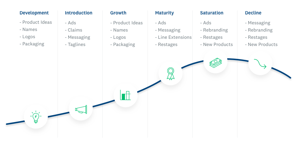
The graphic above can be a helpful guide for when you might consider running a test, but the beauty of concept testing is that it’s flexible.
You can get broad, directional feedback from your survey when you’re early on in the process to see if your concept is on the right track. Alternatively, you can use very specific feedback to make granular changes to a concept that’s almost stitched up, like comparing and adjusting the colors, fonts, themes of an ad or logo. You’ve got a concept, logo, or ad—ideally you’ll test a few alternatives.
Many concept tests, however, will occupy the critical space in between and you want to find out if they’re viable or decide which one is the best.
Each of these types of test serve different functions, require varying levels of effort, and are best implemented at distinct stages of your project’s timeline.
Take a look at the chart below. You’ll note that the type of concept test you run, and when you run it, can have a big impact on your project’s timeline. We’ll cover this topic in greater detail later, but it’s a good idea to use this chart as a reference to ensure you have enough time to complete your project.

03 Survey design
Simple steps for designing a concept testing survey
Setting up your stimuli
At its core, a concept test is all about its stimuli. What do we mean by stimuli? It’s really just a fancypants market research term for the individual concepts, ads, names, or packages you want to test. If you’re testing Concept A against Concept B, both are stimuli. Stimuli fall pretty neatly into three buckets:
- Text (Names, messaging, ad copy, etc.)
- Images/GIFs (Logos, ads, packaging, etc.)
- Video (Internet, TV, or social media ads, etc.)
It’s important to always present your stimuli neatly and consistently—and not just because it looks more professional that way. You want to make sure you’re taking every precaution to avoid biasing your respondents.
Here are some tips (and examples) for presenting each stimuli format like the pros do it.
Text
Our pet food company name survey does a good job of displaying text stimuli in a survey. What does it do well?
- There’s a preview that briefly gives respondents the context of the test, including which logo will go with the copy, and tells them what they can expect from the survey.
- It’s very clear exactly what text we’re testing. It’s in bold, in a larger a font, separated from the rest of the question wording.
- Each associated question re-references the stimuli in the question itself. This reminds respondents what they’re talking about, but it can also help you later in survey analysis. If you’re using the same questions for different stimuli, it can be challenging to know which refers to which—unless you include the name in the question.
Thinking about the name “GoodBoy” overall, which of the following best describes your feelings about it?
In the example above, it’s clear we’re talking about “GoodBoy.” If the question didn’t include “GoodBoy” we wouldn’t be able to tell which name the question is referring to.
Images
Take a look at our pet food ad test survey or logo test survey as an example.
- Clear, high-resolution imagery is always best, especially for images that contain text.
- Always check how the images in your survey look on mobile devices. A very text-heavy ad or webpage design might not come out the way you’d like, so make sure you preview it on a mobile device before you send it out.
Important: In these examples, we embedded the stimulus image at the top of the survey page and had each question reference it. If you’re going to take this approach using SurveyMonkey, make sure to turn off the One Question at a Time feature. It will make it much easier for respondents to go back and forth between the image and the question they’re answering.
Video
Unlike with other types of stimulus, you’ll need to find a place to host your video before you put it on your survey. Luckily, sites like YouTube make the process of hosting videos super simple.
If you have a video that hasn’t aired yet or you’re worried about privacy, some video hosting sites like Vimeo have more advanced privacy options that might be a better fit.
Stop! Check that your project plan and stimuli match.
We didn’t do all that planning work for nothing! Once you think you’ve got the stimuli you want to test, it’s always a good idea to go back to the plan you’ve written out for yourself. Do the stimuli you’re testing actually match your goals?
Will it be a fair test? If you’re testing one completely designed ad against one that’s still a little rough, you already know which will win.
How to write concept testing questions
Choosing the right metrics
Stimuli may be the basic building blocks of a concept test, but the questions you ask about the stimuli are just as important. In concept testing, the questions you ask will be driven by your metrics—the criteria respondents will use to judge your stimuli.
If you read Chapter 1, you already know how important setting a goal is to the planning phase of your concept test. Well, here’s where it starts paying off. The metrics of your concept test depend entirely on your goal.
If you’ve got a clearly defined goal, this section will be easy. If you don’t, it’s going to be challenging. Go back to your goal and compare it to this table:

Which of these metrics best match your project goal? Jot them down—it’s OK if it’s a lot.
If your goal is to compare the effectiveness of two ad concepts, good metrics might be purchase intent, relevance, uniqueness, and sentiment.
If your goal is to assess whether your new logo stands out, ask about visibility, aesthetics, ease of finding, and uniqueness.
A helpful exercise at this point is to imagine you’re presenting your final results to your bosses. Which proof points would convince them that the concept you’ve presented to them is the best, most rigorously tested version?
Turning your metrics into questions
We’ve already talked about how important it is for each stimulus in your survey to be presented consistently and fairly. Well, the same goes for your questions!
To make things easier, we recommend you use 5-point Likert scale questions for evaluating stimuli—especially if you’re new to concept testing. Likert scale questions are closed-ended questions that offer a range of answer options from one extreme to another—from “strongly agree” to “strongly disagree,” for example.
Why use Likert scales? They’re easy to analyze, they offer consistent choices, and they’re simple and intuitive for respondents.
Most importantly, Likert scales share a consistent logic to their answer options, which makes it easy to plug a metric in and get back an effective concept testing question. For example, let’s say the metric you want to measure is “uniqueness.”
Simply plug it into a Likert scale question template like this:
How _____ is the stimulus?
A. Extremely _____
B. Very _____
C. Somewhat _____
D. Not so _____
E. Not at all _____
The result is a completed question:
How unique is the logo?
A. Extremely unique
B. Very unique
C. Somewhat unique
D. Not so unique
E. Not at all unique
Using this technique makes it easy for you to turn your desired metrics into useful concept testing questions. If you want to make it even easier, we’ve got questions that reflect nearly all the metrics in the graph above in SurveyMonkey’s Question Bank.
Pro tip: If you’re paying for survey responses through a survey panel like SurveyMonkey Audience, it’s usually a good idea for you to use forced-answer—or required—survey questions. That way, you’re sure to get responses to all your questions.
Building your concept testing survey
You’ve decided on your goal, your stimuli are just right, and you’ve turned your metrics into good survey questions. Now you can begin actually building your concept testing survey! The good news is that you’ve already got all the pieces—now all you have to do is arrange them into a consistent survey design.
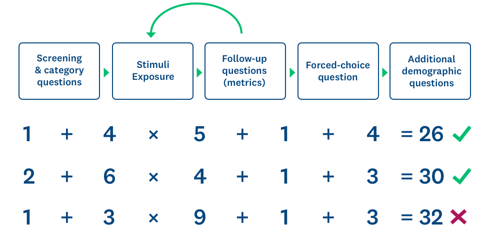
Here’s the general survey design we recommend you use. We’ll go into detail about each type of question and how to use them throughout this guide.

As always, it’s just a little more complicated than simply plugging in your stimuli and questions into this outline. There are two major factors that can affect your survey design: the number of stimuli you’re testing and whether you’re using a sequential or monadic survey design. Let’s take a look at each of these areas.
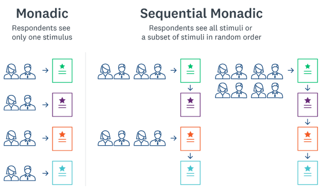
Sequential vs. monadic survey design
Sequential and monadic survey design are the two main methods of presenting your stimuli to your target audience. Each choice has its own advantages and drawbacks, but both play critical roles in concept testing surveys. Here’s an easy graphic to explain which survey design type is which:
We wrote an entire article about when to use which survey design type, but here’s the gist:
In monadic survey design, you take a target audience, divide it up, and show each subgroup a different stimulus. Since they’re all from the same pool of respondents, it’s fair to compare their responses against each other to pick the “winning” stimulus from the group.
In sequential survey design (sometimes called sequential monadic survey design), you pick a target audience and show them several or all of your stimuli. Since these stimuli appear in a random order, it’s fair to compare their responses to determine a “winning” stimulus here, as well. Here’s a quick primer on the pros and cons of each type of survey design.
Monadic design
Pros:
- Reduces survey fatigue (especially for complex stimuli like videos, wordy ads or stimuli that are extremely similar).
- Preserves data quality
- Eliminates order bias to increase statistical rigor
- Allows you to test for more metrics per survey
Cons:
- Requires a larger sample size and is therefore more expensive
- Feasibility can be limited
- Fielding time is typically slower
Sequential design
Pros:
- Requires less sample and is therefore less expensive
- Feasibility
- Fielding time is typically quicker
Cons:
- Longer surveys might cause survey fatigue and lower data quality
- Order bias might impact validity of results (randomization of stimuli helps this)
We’ll cover a lot of the factors that go into which survey design type you choose later, but for now it’s important to understand the difference between the two.
Survey length: It starts with the stimuli
Whether you use sequential or monadic survey design, we recommend you never let the number of questions get above 30. Any more than that and you’ll put undue burden on your respondents, which may cause them to drop out of your survey and damage your data.
This might seem like an awful lot of questions, but if you have several stimuli you want to show, a bunch of questions to ask about each of them, plus screener and demographic questions, you’ll get there much faster than you might expect.
Here’s a good rule of thumb to follow:
Make sure the number of stimuli you want to test multiplied by the number of metrics questions for each is less than 25. That will ensure you’ve got enough room in your survey for the other question types.
If you don’t have 30 questions in your survey, that’s totally fine!
A focused survey with questions in the teens can be better than a longer one that’s pushing 30.
Experimental design: Best practices for creating a concept testing survey
While monadic and sequential survey design can change the length of your survey, it doesn’t really change the general survey design we laid out in the beginning of this section. Let’s go over each section and the question types it contains.
Introductions
It’s a good idea to let respondents know why they’re being surveyed and what the survey will contain before they answer anything. This is also a good opportunity to give any additional instructions or disclaimers you might want to include. Here’s an example you can use:
We would like to hear about your opinions about 3 advertisement concepts for our pet food company. There are no right or wrong answers. All of your answers are confidential.
Tips
Do…
Let respondents know that they’re going to see multiple stimuli (if you’re using a sequential design). It’s a good way to combat bias and survey fatigue.
Keep your introduction short and sweet. Longer introductions can scare your respondents off.
Don’t…
Get too wrapped up in describing how long the survey will take. If you feel the need to warn your respondents about your survey’s length, it might be too long.
Screening questions
Most panel solutions like SurveyMonkey Audience will have targeting parameters that give you an audience that mirrors potential consumers of your concept. But if you’re surveying a more general audience or you want to go a level deeper than your targeting parameters allow, you can use screening questions.
Screening questions are questions you can ask at the beginning of the survey to disqualify respondents who don’t fit your targeting criteria.
For example, maybe you’re surveying a sample of pet owners but you really want pet owners who have bought pet food online. You might consider using a screening question to filter out the pet owners who haven’t ever bought pet food online.
Tips
Do…
Think hard about how important it is for you to use screening questions to reach a narrower demographic. It could make it more difficult to find enough respondents for your survey or delay your project’s timeline.
Don’t…
Ask screening questions that are too specific. For example, it will be much more difficult to find respondents who have bought pet food in the past week than to find respondents who have bought pet food in the past year.
Category questions
Category questions usually appear just after screening questions and are designed to help you understand more about your respondents without disqualifying them. Here’s an example of how screening questions and category questions can work together.
Screening question: How often do you shop for pet food online?
Category questions: Which of the following websites do you use to shop for pet food? What brand of pet food do you buy?
Tips
Do…
Add category questions to the beginning of your survey. They can “prime” your respondents by helping them think about the subject before they start seeing stimuli.
Keep your category questions focused on the subject. Save questions not related to purpose of your survey for the demographic questions at the end of survey.
Don’t…
Add too many category questions. They can distract from the part of your survey you care most about: the feedback on your stimuli.
Stimuli and metrics questions
We’ve already gone over these in earlier sections, but this is the real meat of your survey. It’s here that you’ll get all the important metrics that will determine how your concept lands. It can also be the longest section of your survey, depending on what survey design scheme you use.
Tips
Do…
Place each stimulus on its own page and randomize the page order. This is the best, most common, concept testing survey design. It helps against primacy bias, the tendency for respondents to respond more favorably to the first stimulus they see.
Ask questions on the same metrics in the same order on each page, for consistency’s sake. It’s more intuitive for your respondents that way and you’ll get consistent data.
Don’t…
Randomize how the answer options in your Likert scale appear. In fact, it’s best to decide on an order of answer options—positive to negative or negative to positive—and stick to it throughout your survey.
Final forced-choice question
Sometimes casual pet food shoppers might not have a strong opinion on what logo you end up using. It happens. A final forced-choice question is your failsafe for situations like this.
*13. Now that you’ve reviewed our logo designs, please pick your favorite!

Just in case there’s not a statistically significant difference in how respondents react to your stimuli, it’s usually a good idea to force respondents to choose their favorite. This can also be a good tie-breaker if respondents come down equally on two different metrics and you can’t decide which is more important. For example, what if respondents think concept A is very believable, but concept B is equally distinct? Asking them to choose their favorite can be the perfect way to make a final decision.
Tips
Do…
Consider using images as answer options (as shown in the example) instead of words. It’s a much more simple and intuitive way for your respondents to choose their favorite.
Don’t…
Use ranking questions, which ask respondents to rank answer options by order of preference. They’re taxing on your respondents’ attention and difficult to take on mobile.
Demographic questions
Similar to category questions, you can use demographic questions to get more detailed profiling information than your survey panel provides. Demographic questions don’t need to be related to the subject of your survey and they usually come at the end. They’re very useful tools for filtering your data.
Want to know if retired women are more likely to buy your pet food? Ask about their job status in demographics questions and filter by question and answer to see how retired women answered.
Tips
Do…
Check that your demographic questions have the appropriate answer options to meet your research needs. If you’re going to break down millennials’ responses to baby boomers’, make sure your answer options have the right age ranges.
Use the demographic questions in SurveyMonkey’s question bank. They’re written by survey experts and cover a lot of the most common areas for demographics questions.
Don’t…
Double up on demographic questions. Most survey panels like SurveyMonkey Audience have some of these profiling questions built in.
Need some inspiration?
Our survey experts designed these survey templates specifically designed for the most popular concept testing use cases. Use them to get ideas or as the starting point to begin creating your own concept testing survey!
Name testing
Coming up with a name that’s both catchy and relevant is tough. Make sure consumers see it that way.
Preview templateLogo testing
Choose a logo that differentiates your product and stands out on the shelves.
Preview templateProduct testing
Understand how your future customers will respond to product ideas before they go to market.
Preview templatePackage testing
Listen to how consumers react to your package design to ensure it will stand out on the shelves.
Preview templateMessaging
Make sure your copy and claims explain your product and convince people to buy it.
Preview template04 Fielding
When, how, and who to send your survey to
Who to target
Who you send your survey to and your survey’s level of rigor has everything to do with what you’re testing.
As we mentioned in the planning section of this guide, not every concept test you do requires a full-blown test with a finely tuned and targeted audience. Some, though, definitely will. Let’s take a look at three broad groups of people you might sample for your concept testing survey.
Friends, family, social followers, coworkers
Let’s be clear—you’re not going to be sampling a representative population here. It’s not going to be statistically significant, and it’s not going to be information you present at your next strategy meeting. But there’s real value in getting feedback from your connections early in your project, and it doesn’t cost you anything. Here are some examples when you might send surveys to this group:
- You’re an enthusiasm-rich, cash-poor startup and you want to get some initial feedback on your name, logo, or website. Anything jump out? Are you heading in the right direction?
- You’ve got a somewhat risky concept—an ad, some copy, or a product idea—and you want a little bit of direction. How do they like it? Not as funny as you thought? Does it cross the line?
A sample of your loyal customer base
Your customers can be another viable (and free!) sample to survey, but you need to be a little more careful about what you put in your survey and how you present it. The real value of surveying your existing customers is collecting feedback on something they’re familiar with already—your product, your website, or brand, for example.
Surveying your customers can make them feel included in your development process, which can really boost your customer loyalty.
- Are you adding a feature or tweaking or improving an existing product? In some cases, sampling your current customers can actually be a lot better than a population of potential customers. They already know how your product works and their insight might be much more valuable than a random population’s.
- Plenty of rebrands and logo changes go astray. Sometimes it can be a good idea to check these kinds of changes with your customers first. After all, they’re the ones paying the bills. It’s still important to send your survey to the population at large (especially if you’re a consumer brand), but your customers can give you some preliminary pointers.
A representative sample from a survey panel
In many cases—particularly ad and concept testing or brand-new products—you really want to sample the market. You need feedback from a group of people that mirror your customers, consumers or viewers. Here’s where a trusted survey panel with good targeting parameters comes in:
- If you’ve developed a brand-new product and you want to determine product-market fit, you need to understand how the market feels or you’re risking everything. Don’t just sample the population at large. Really home in on your market, like middle- to high-income dog owners who care about giving their pet organic food.
- If you’re airing an ad on HGTV, target the HGTV crowd. If you’re putting an ad on the sides of buses in San Francisco, then, you guessed it, sample residents of San Francisco. If you’re targeting a general audience, however, it’s actually a better idea to target a broad, relatively unfiltered population.

Find just the right people to take your concept testing survey
SurveyMonkey Audience gets you the right survey respondents fast and easy and helps you target them by demographics, consumer behavior, geography, or even designated marketing area.
Selecting your sample size
If you’ve decided to send your survey to a survey panel, the next most important step is deciding how many people to send it to. The sample size of your survey can have significant effects on your results, so it’s worth putting some thought into. There are 4 main factors that can affect your sample size, and you’ll want to consider each one before you make your decision.
Margin of error
The margin of error, or confidence interval, tells you how much you can expect your results to differ from the population you’re sampling as a whole. Essentially it tells you how confident you can be that your survey results are truly representative. For example, if you have a 5% margin of error and 60% of respondents say they like concept A the most, the true value is actually between 55% and 65%.
Having a low margin of error is important for the validity of your results, but it can really affect your sample size.
Let’s put this in the context of our pet food example. 85 million households across the U.S. own a pet. Let’s say that’s roughly our overall population we’d like our survey to represent. If you want a representative sample of that group, with a 95% confidence level (the probability that your sample accurately represents your population) and 5% margin of error, you’d have to send your survey to 385 pet owners. If you want your margin of error to be 3%, however, your sample size jumps to 1,068.

Don’t worry if this sounds confusing! Just estimate the size of the overall population you’re sampling, determine the margin of error and confidence levels you’re comfortable with (5% and 95% respectively are generally safe bets) and use this sample size calculator or this margin of error calculator to find what your sample size should be. If you’re still curious, the calculator page also has a ton more information that explains this. Looking for a quick and dirty view?
Experimental design
How you design your concept test can make a big impact on how many people you survey. Let’s use the example from the previous section and say that we need to survey 385 pet owners in order to be confident in our results.
Think back to the discussion in the previous chapter about monadic vs. sequential survey design. If you’re doing a sequential test, where all respondents see all your stimuli, all you need is 385 responses. If you’re doing a monadic design, however, you’ll need 385 respondents to see every stimulus in your test. That means if you have 6 stimuli and you’ve chosen a monadic survey design, you’ll actually need 2,310 responses (385 per stimuli).
Monadic survey designs can make your sample size grow really quickly, but they’ve got real benefits. For example, you’d never want to use a sequential survey design to test six 2-minute video ads. They’d need to spend 12 minutes watching videos, and that doesn’t take into account the time it takes to take the actual survey!
Feasibility
The more niche a population you target, the less feasible it’s going to be to find enough people to get a good sample size. For example, if you want to target middle-income, female pet owners, it probably won’t be too difficult to find respondents. If you wanted all those criteria, plus pomeranian owners from California, you might not be able to get enough respondents.
It’s a much better idea to ask the extra information you’re looking for as demographic questions and use filters to see how those respondents answered.
In the example above we’d target middle-income female pet owners and ask them what state they live in and what kind of dog they own. When all the results are in, we’d use filters to see how that niche group responded.
Budget
At the end of the day, you have to work around your budget. Even if you can’t afford to run the concept test you’re hoping for, it’s still worthwhile to run a test. Do what you can afford, because some data is much better than no data at all.
When to launch your survey
Generally, you shouldn’t worry too much about when to launch your survey, but there are some best practices to follow that can give you an extra leg up.
Seasonality
We’ve found that response rates don’t really drop around the holidays—probably because everyone is hanging around at home without work to do. But you might start seeing discrepancies in your data when the concepts you’re testing have to do with a particular season.
For example, the purchase intent of your ice cream product is probably going to be significantly lower in a survey you launch in the dead of winter than one you launch when it’s boiling hot outside. You should expect to see differences like this in your data (we’ve seen plenty of examples ourselves).
Chances are, you don’t have a product that’s going to fall prey to this kind of issue, but it’s definitely worth considering if you’re seeing big changes in metrics that tested fine 6 months ago.
Day of the week
Since Audience gets back responses so fast, we’ve picked up slight differences in the day-to-day timing of your survey. While it doesn’t particularly matter what time of day you send a survey, the day of the week can play a factor. Don’t worry: Average survey response rate doesn’t change much between weekends and weekdays, but the response times are little more spread out (turns out people answer a lot of surveys during work hours).
Hungry for more best practices on when and how to send your survey? We’ve got a whole webinar about it, featuring two of SurveyMonkey’s very own survey experts.
Respondents by time of day (weekdays)
N = 191,464

Respondents by time of day (weekends)
N = 27,967

More significantly, we see a lot more respondents using mobile devices to answer surveys during the weekend. What’s that mean for your survey?
You might not want to launch a really text-heavy ad or website design test on a Friday night because more people will take it on mobile devices.
These tips won’t impact the quality of you results much, but they’re considerations.
05 Analysis
How to turn survey responses into valuable data
Calculating your Top 2 Box scores
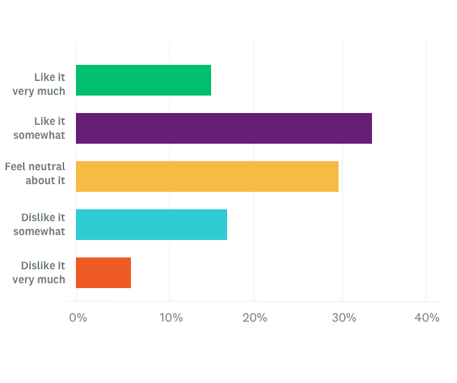
Market researchers have a trick for simplifying the data they get back from their concept test surveys. If you used 5-point Likert scales as we recommended in this guide, your data probably looks something like this:
If the product were available today, how likely would you be to buy the product?

This chart may be easy to read by itself, but when you have to compare 5 different metrics across 4 different stimuli, things can get a little dicey.
That’s where Top 2 Box scores come in. If you’re a marketer for a pet food company, you probably care a whole lot more about whether people are likely or extremely likely to buy your product than about anything else. You can add together these top 2 responses to calculate your Top 2 Box score.
In this case, the 15% of respondents who answered extremely likely plus the 25% of respondents who answered very likely add up to a Top 2 Box score of 40%.
You can really simplify the analysis portion of your survey by calculating your Top 2 Box score. SurveyMonkey will do it for your automatically when you use the combining answer choices feature.
Building a scorecard
Once you’ve calculated the Top 2 Box score for all your questions, it’s time to start plugging them in to a scorecard. Scorecards are a helpful way of getting a simplified top-down view of your data, like this:

See how much easier it is to pick a winner when your questions are arranged in scorecard format? Let’s take a look at the full scorecards from our pet food examples:
Pet Company Logo Test (Top 2 Box Scores)
PuppyLove Ad Test (Top 2 Box Scores)

As you can see, organizing data into scorecards and then clearly highlighting the winner makes it easy to read and quickly understand which concept was a winner. Since your scorecard provides an overview of your results, it’s also a good idea to include the results of your forced-choice question or any demographic breakdowns you find surprising, interesting, or helpful.
For example, you might want to compare the differences in answers from male and female respondents. Here’s what that might look like:
Puppy Love Ad Test (Top 2 Box Scores) by Gender

Pro tip: SurveyMonkey will automatically produce demographic breakdowns for you when you use the compare rules on demographic questions in Analyze.
Getting to statistical significance
Remember when we were talking about sample sizes and confidence intervals? Those techniques are basically ways to achieve statistical significance in your results. In a nutshell, statistical significance is the degree to which you can be confident in your results. It tells you how confident you can be that a difference or relationship exists.
Take another look at the scorecard example from before.
- In the uniqueness category, logo A and B both have a C underneath them. This indicates that the difference in uniqueness between logo A and C is statistically significant and the difference between logo B and C is, as well.
- In the appeal category, logo B has both a A and a C underneath it. This means there’s a statistically significant difference between logo B and both logos A and C.
- In the visibility category, however, there’s no callout, even though the scores are different—34% to 38%. That’s because the difference isn’t big enough to be statistically significant.
If there isn’t a statistically significant difference between stimuli, you should pause before acting on this information.
A difference of 35% and 40% in purchase intent for an ad campaign, for example, could mean millions of dollars in potential revenue.
So how do you find out whether the differences between your stimuli are statistically significant? The easiest way is to run each of the Top 2 Box scores on your survey through a statistical significance calculator. We’ve formulated our very own calculator to help you do it.
06 Action
Transform data into action
How to pick a winner
Picking a winner may seem like a pretty obvious exercise at this point. Build your scorecard, highlight the winning metrics, and select the concept that has the most metrics highlighted. Sometimes it really is that simple, but not always.
Some metrics matter more than others, which can really affect which concept ends up being the winner. That’s why it’s important to prioritize the metrics you study. If concept A and B are pretty close on most metrics, with concept A slightly ahead, it might seem like concept A should be the winner.

But notice that concept B performs significantly better than concept A in the purchase intent metric. That metric is probably more important to you than metrics like visual appeal or difference from the competition. A product or ad that drives sales is obviously your end goal, so it makes sense to give it more weight and consider selecting concept B.
Important: Don’t forget about margin of error here—particularly if you’ve got results that are very close. Remember that if concept A and B are within 2 to 3 percentage points of each other and your margin of error is 5%, the difference is really probably too close to call—even if it looks like there’s a winner. These are cases where having a forced-answer question at the end can really help out. They’re the perfect tie-breakers for close calls.
Oftentimes you’ve got to take into consideration more factors than simply which concept wins. What if you’re testing a product that your customers clamored for or an ad campaign that supports a broader company goal?
Take the survey results in the context of all the other data points at your disposal to make a decision. If I’m testing a new ad against an ad I’ve been running for years and my company strategy is to provide a fresh perspective, it might be OK if the old ad still beats the new one by a few percentage points.
Benchmarks
Setting benchmarks takes time, but it can be really great way to assess the performance of your concepts in a broader context. Benchmarks are standards you can compare yourself against to see how your concepts compare in the context of your previous concepts or your competitors’.
For example, you can compare how your ad from last year fares against your brand-new one in order to assess the health of that concept. If your new ad doesn’t win, it might be time to try a new approach.
Another common approach is to have a “control” option in your survey (maybe an old high-performing ad) to compare against all your fresh options. The ability to beat the old ad might be just as important as picking a winner from your batch of new ads.
Finally, many market researchers create surveys that test their competitive assets to see how they stack up. For example, if market researchers at GoodBoy wanted to test how their ads or packaging design compared against their competitors at PupLove, they could build a survey with concepts from both to get a sense of how they stack up competitively.
Taking action
Congratulations! You’ve built your concept test from the ground up and gotten meaningful results from your surveys. Now, if you’re part of a research team, maybe all you have to do is hand off your results and recommendations.
But if you’ve got ownership of an ad or product process, the next steps are up to you. You’ve got to show and convince your stakeholders that the concept you’ve chosen is the best. That means putting your results in a format they can understand (and that fits easily on a presentation slide). Scorecards are perfect for that.
Remember: Don’t be afraid to pivot or change course if the data shows something alarming, surprising or if it brings up something you hadn’t considered before. After all, that’s why you began this test in the first place. The ultimate goal is to help you take a shot that’s going to be good for your business.
Get started on your concept testing project today
Now you’ve got everything you need to build your own concept testing program. Ready to take the next step?
Explore all our expert solutions
SurveyMonkey’s expert solutions for concept testing create and analyze your survey so you get fast, reliable insights.
Find your audience
Reach consumers in over 130 countries with SurveyMonkey Audience to get real-time feedback on your ideas.
Discover more resources
Understand your target market to fuel explosive brand growth
Brand marketing managers can use this toolkit to understand your target audience, grow your brand, and prove ROI.

How data at work impacts the employee experience
New research on the role of data on the employee experience; how it impacts decision making, worker confidence, and trust in teammates and leaders

3 workplace trends that will reshape today’s workforce
New research on workplace trends and how employees are balancing personal time, working from home, and the gap in remote and in-office work