11 essential UX metrics to improve user experience
Discover how to measure user experience, make data-driven UX improvements, and show ROI for your business.

If you care about enhancing your customer experience (CX), you must pay attention to your user experience (UX).
UX is a critical branch of CX because a bad user experience will leave you with unhappy customers. Unhappy customers don’t stick around.
So how do you prioritize and improve user experience? It starts with tracking UX metrics to make data-driven enhancements.
In this guide, we’ll break it all down:
- What you need to know about attitudinal and behavioral metrics
- The UX metric examples that are most valuable
- How to show the ROI of UX updates and more
What is user experience (UX)?
User experience (UX) is how people interact with or experience your product, app, or website. Have you made it easy and intuitive for users to solve a problem or fulfill a need? Or are they stuck in a frustration loop?
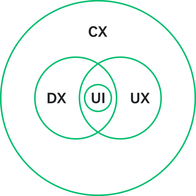
User experience vs. digital experience vs. user interface
User experience is part of the bigger CX ecosystem, including the digital experience (DX) and user interface (UI).
Digital experience is all the interactions a customer has with an organization via digital touchpoints—website, app, social media, etc.—and the feelings or perceptions the customer has about those interactions.
User interface is every element impacting user interaction on a device, website, or app. This encompasses buttons, icons, spacing, typography, responsive design, and more.
Here’s how CX, UX, and DX overlap:
Related: How to use UX surveys to test ideas
What are UX metrics?
UX metrics are quantitative and qualitative datapoints showing the quality of people’s interactions with your product, app, or website. You can use them to measure, compare, and track the effectiveness of your UX design strategy.
Why do we measure UX?
A great user experience results in more satisfied users, higher conversion rates, and fewer technical issues—which reduces business costs in the long run.
On their own, UX metrics are user-focused, not business-focused. But what’s good for the user is good for the business. For example, UX could play a big role if your business aims to improve customer retention and loyalty. A user experience that’s easy and pleasant is an experience that will spark brand advocates and repeat customers.
Types of UX metrics: Behavioral vs. attitudinal
There are two major types of UX metrics: behavioral and attitudinal. Understanding the difference comes down to whether you’re measuring the behavior of a user (e.g., how long it took users to complete a task) or the attitude of a user (e.g., how confident users felt as they navigated the task.)
Behavioral UX metrics
Behavioral metrics are typically quantitative and measure the actions users take when they interact with your product. How often do users use your mobile app? How long does it take? What pages do they view?
You can often track behavioral metrics automatically, without intervening with the user experience, through site/app analytics, user session data, bug reviews, and more. However, this only provides one piece of the UX equation. While you might see data that shows that the experience broke down, you won’t know why, how the user felt about it, or what impact it had on them. That’s where attitudinal metrics come in.
Attitudinal UX metrics
Attitudinal metrics measure how users feel and what they say about your product. Do users think your app is easy to navigate? Do they find your website useful? How satisfied are they with the quality of your checkout experience?
Attitudinal metrics can be both quantitative and qualitative. For example, the quantitative NPS rating and qualitative NPS feedback provided in a follow-up open-ended question.
While behavioral and attitudinal are the overarching types of user experience metrics, it can also be helpful to break metrics down based on specific focus areas. For example…
Usability vs. engagement vs. satisfaction
Want to know how efficient your website flow is? Usability metrics pinpoint ease of use and include behavioral data such as task completion rate or number of errors.
Is your customer engagement dipping because of user experience? It pays to track behavioral data like page views and session duration and prioritize qualitative attitudinal user feedback from open-ended survey questions.
What is your app doing right, and what can be improved? Satisfaction metrics, like Customer Satisfaction (CSAT) score, help clarify whether your user experience meets expectations.
11 best user experience metrics to track
Behavioral: Completion time/time on task
Completion time, also called time on task, is the time it takes for a user to complete a specific task within your website or app. This usability metric can be gathered through direct observation (e.g., sitting in a room with a user and noting their actions and time spent) or backend user analytics. Tracking completion time is smart because it’ll tell you if your system is working as intended and flag issues that could be causing customer satisfaction downturns.
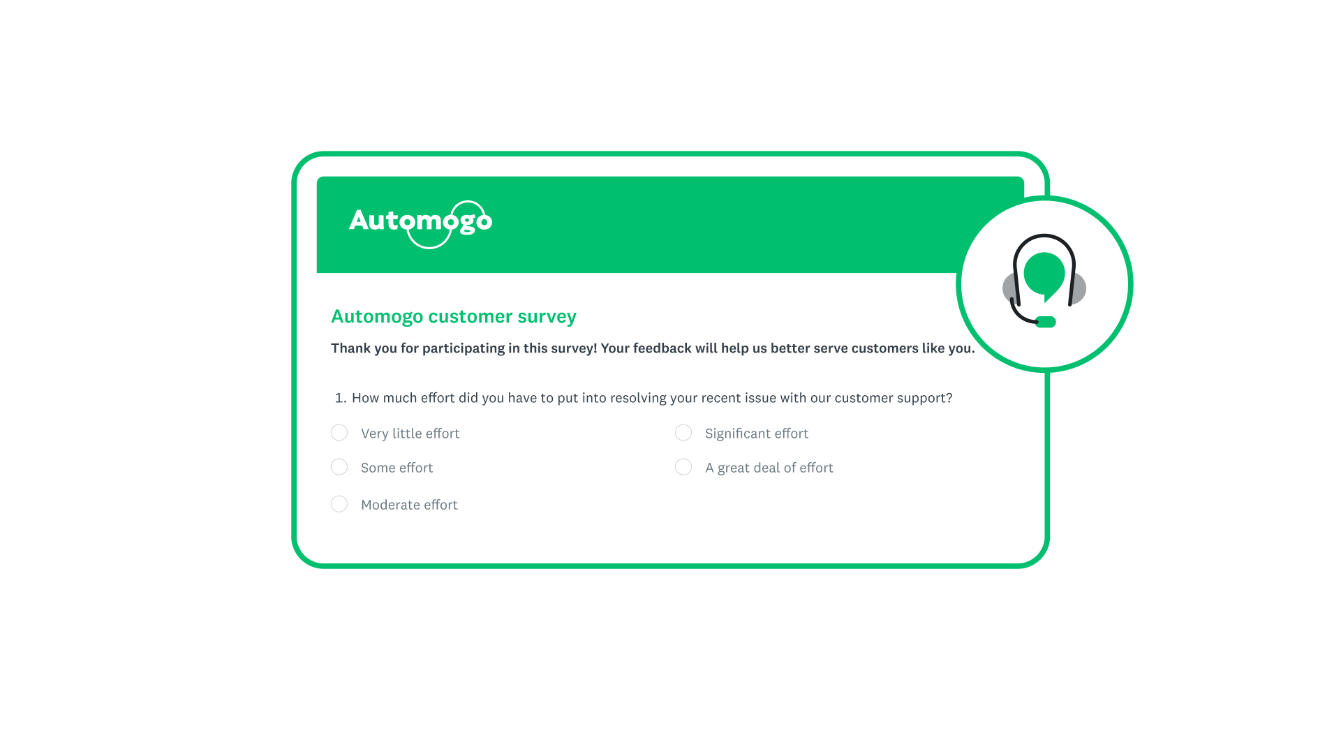
Attitudinal: Customer Effort Score (CES)
On the attitudinal side, you can also uncover usability through your Customer Effort Score (CES). The data that a CES survey collects is self-reported—meaning, it’s the user’s perspective—and will show the effort it takes for someone to complete a task or interaction. Your UX should always aim for low-effort experiences to minimize frustration and get customers where they need to go faster.
Behavioral: Error rate
Error rate is how often a user makes a mistake while using your website or app. This could include clicking an area on a website that isn’t actually clickable or selecting the wrong page. Think of error rates as red flags in the user experience; they reflect pain points where customer expectations are not being met.
Attitudinal: System Usability Scale (SUS)
The System Usability Scale comprises ten specific ease-of-use questions, answered on a five-point agreement scale. SUS questions aren’t complicated and are typically asked through user surveys; however, the score itself is a bit complex to calculate, and you won’t end up with any diagnostic details about the user experience.
Behavioral: Conversion rate
Conversion rate is the percentage of users who take a desired action on a website or app. This often means the percentage of website visitors who make a purchase. Conversion rate could also be the percentage of people who upgrade subscription packages, sign up for a newsletter, download an app, and more.
Conversion rate is a handy metric because it shows you what happens once people are on your website. If you spend a ton on ad campaigns to drive people to your site, your conversion rate will tell you whether they’re taking action once they get there. If the answer is a disappointing “no,” you may need to reconsider UX elements.
Behavioral: Return rate
If your company is focused on retention, then you’ll want to pay attention to your return rate. This key metric refers to the percentage of users who come back to your website or app after their initial visit.
Return rate can help you understand the ROI of user experience investments. For example, it’s a good sign if your return rate jumps after you make UI/UX improvements like adding more features or simplifying your checkout process.
Attitudinal: Net Promoter Score (NPS®)
Your Net Promoter Score shows how likely customers are to recommend your product, app, or website based on the experience they had.
As a customer loyalty metric, it can reveal user experience issues, opportunities, or wins—if the standard closed-ended NPS question is followed with an open-ended question that gathers more details.
For example, let’s say people were giving you an NPS of 3. Without context from open-ended feedback, you wouldn’t know that those scores were due to a poor website experience.

Behavioral: Loading time
In today’s digital world, tracking loading time, or the time it takes for your website or app to fully load, is a must. If your digital experience is slow, chances are high that visitors will get frustrated and abandon your site—which will add up to an unsatisfying experience. Keep in mind that loading time can refer to:
- Page load time: The time it takes for a webpage to load.
- Response time: The time it takes for an app or website to respond to a user’s action or request (e.g., the time it takes for a confirmation screen to appear after a user submits a contact form).
Behavioral: Scroll depth
Are users invested in what they see on your website or app or just taking a cursory glance? Scroll depth measures how far they scroll down a page—showing if you’re keeping users engaged.
This website metric gives you more context than page views, because it reveals which parts of a page might be attention-grabbing and which parts are losing eyes.
Attitudinal: Satisfaction
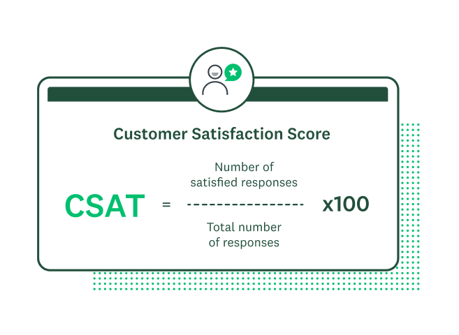
Satisfaction measures how satisfied the user is with the experience of your product or website, from the features to the functionality. Satisfaction with UX can be measured in the same way as customer satisfaction: using the Customer Satisfaction Score (CSAT).
CSAT is a multi-functional metric. It can give you a general view of customer emotion, or a magnified look at the mood around a specific topic, feature, or step in your customer journey. In most cases, CSAT is based on a 5-point scale from very unsatisfied to very satisfied.
To calculate the percentage of satisfied customers:
- Divide the total number of satisfied customers by the total number of responses
- Multiply by 100
Behavioral: Accessibility score
Accessibility should be an inherent part of any website or app experience, and your accessibility score tells you how well you’re conforming to best practices, guidelines, and nondiscrimination laws. This can be critical to your user experience as accessibility goes hand-in-hand with usability. By focusing on accessible UX design, you’re making sure that everyone can use your web or app content.
How to measure UX and take action
So how do you measure your user experience and make the right decisions based on that data?
Here are 5 basic steps:
1. Collect the UX performance metrics
How you collect your UX data and performance metrics will depend on what kind of data you’re aiming to get. Launch surveys or conduct user interviews for attitudinal data. SurveyMonkey has 400+ expert-built survey templates to help you collect CSAT, NPS, and other feedback quickly and efficiently. Plus, the information you collect can help guide your focus group discussions and further UX exploration.
For behavioral data, dive into your site analytics and usability tools to gather quantitative research. You can also set up heat maps to get a deeper understanding of how people interact with each element on your website.
2. Consider your current performance and industry benchmarks
Benchmarking your end user experience metrics is an important part of UX design. It’s good to know how far you’ve come and how you compare to others, even if it’s just to have a better understanding of user expectations in your industry.
UX metrics can be benchmarked against previous designs, the industry, and key competitors. Just make sure you don’t get lost in what the competition is doing. Innovate, don’t imitate.
3. Set data-driven goals
Take time to comb through all your UX metrics and make sure they’re centralized and accessible to your broader organization, not just UX design teams. If there are troublespots, think about how you want to improve. If there are untapped UX opportunities, think about how they fit within your business goals.
What outcomes do you want to improve for the user?
- Ease of use
- Goal completion rates
- Satisfaction/great experience
What outcomes do you want to see for the business?
- Increased conversion rate
- Increased purchases/reduced cart abandonment
- Reduced support volume/costs
- Reduced development costs
- Increased retention and referrals
4. Experiment
Make UX updates based on your goals and the metrics you have. If you saw a low scroll depth, you may want to rearrange your webpage layout. If your checkout process received low CES ratings, you should make updates to simplify the experience. Use your UX metrics to experiment wisely.
5. Measure the ROI of UX changes
ROI connected to UX is sometimes hard to prove directly or causally. There may be other factors at play, including broader changes to your customer experience or business. But you'll be better off if you can draw as straight a line as possible between the work and the outcomes.
- Collect new UX data to see what’s changed since you made updates. Wherever possible, you should also gather other data like employee and operational metrics.
- Describe each improvement you made, including what it involved, time spent, and the datapoints that inspired the change.
- Outline which metrics were impacted. How did the customer benefit? In what ways did updates create value for them? Be sure to explain how UX initiatives affected the business outcomes that you considered as you set goals (conversion rate, cart abandonment, support costs, etc.) and quantify as much as you can. Your UX impact is not just about added revenue but reduced costs.
Need to prove ROI before you make UX investments?
Start by arguing that poor design is expensive and improving the user experience not only benefits the users but saves the business money.
Then, recreate the steps above to outline the time, effort, and resources needed for a proposed UX initiative. You must quantify how that initiative will impact the user and drive business outcomes.
How to choose the right user experience metrics
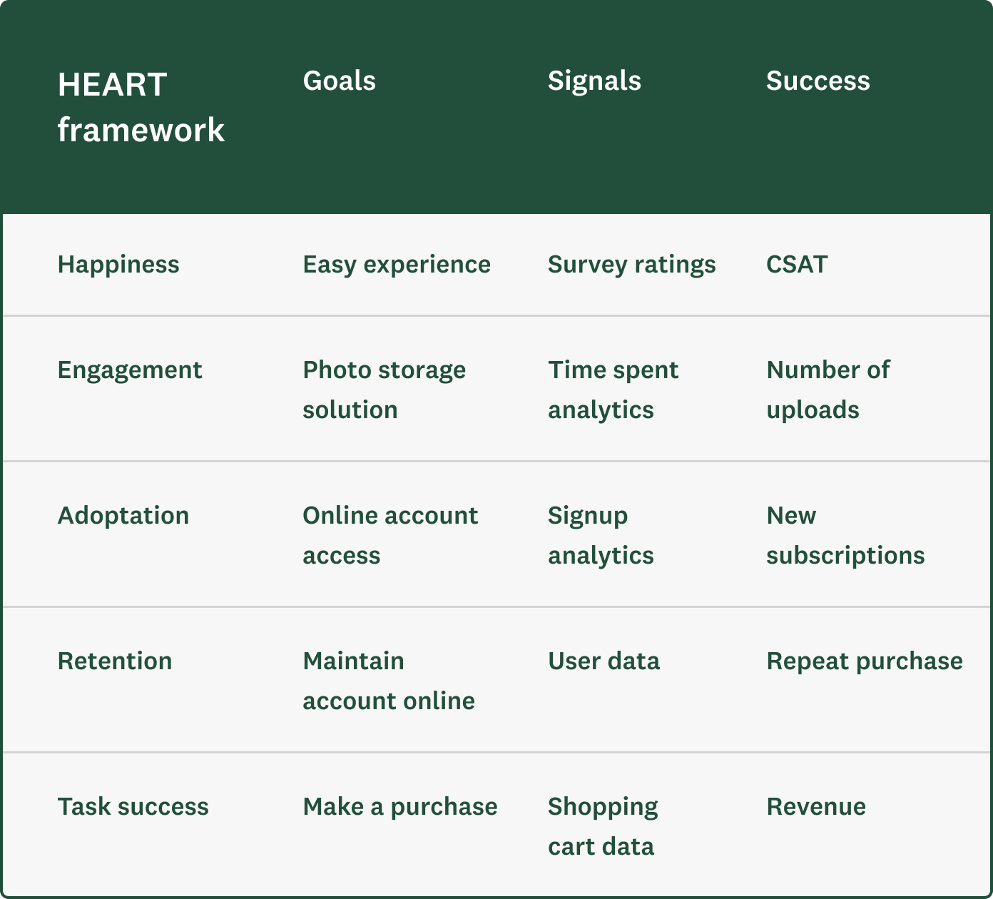
Not sure where to start with UX metrics? Many customer experience professionals and UX designers lean on the Google HEART framework to:
- Pinpoint goals (ex: user outcomes)
- Identify the signals that indicate success (ex: survey ratings, user data)
- Select the identifying metrics to track (ex: CSAT)
The HEART framework of user-centered metrics was developed for web-based UX. However, it can be applied to any user experience.
HEART stands for Happiness (satisfaction), Engagement, Adoption, Retention, and Task success. Looking at each description below, you’ll find they’re all either attitudinal or behavioral metrics.
- Happiness: attitudinal measures like satisfaction, likelihood to recommend, and ease of use
- Engagement: usage metrics, like the number of visits per user per week or the number of photos uploaded per user per day
- Adoption and Retention: metrics like the number of unique users per time period, to distinguish between new (adoption) and existing/returning users (retention)
- Task success: behavioral metrics, like efficiency (time to complete), effectiveness (ability to complete, percentage completed), and error rate
Here’s an example of how to approach UX metrics within the context of the HEART framework:
Improve the user journey with SurveyMonkey
Ultimately, prioritizing UX is prioritizing your customers. Collect both behavioral and attitudinal UX metrics to measure, compare, and track the quality of the user experience over time—and don’t skip out on the opportunity to leverage real-time user feedback. With the right UX metrics, you can demonstrate how your improvements impact both the user and the business.
Learn how SurveyMonkey can help your business improve user and customer satisfaction, or sign up for a free account today.
Net Promoter® and NPS® are registered trademarks of Bain & Company, Inc., Satmetrix Systems, Inc., and Fred Reichheld.
Ready to get started?
Discover more resources

Solutions for your role
SurveyMonkey can help you do your job better. Discover how to make a bigger impact with winning strategies, products, experiences, and more.

AI customer service: 4 lessons on what your customers actually want
AI customer service is a gamble if you don’t have the right strategy. See what our customer experience research says about putting people first.

Automate SMS survey invites directly from Salesforce
Trigger personalized survey invites via text when Salesforce records change—and sync every response back automatically.

Customer service trends & statistics for 2026: Why consumers still trust humans over AI
79% of Americans prefer human customer service over AI. Discover why consumers still trust humans more and what this means for your 2026 strategy.