You’ve got data, lots and lots of lovely data to view! But nobody wants to spend tons of time sifting through data that’s just not visually appealing to look at. Not only does it make for a boring analysis experience but it can make extracting the insights you need a time-wasting challenge.
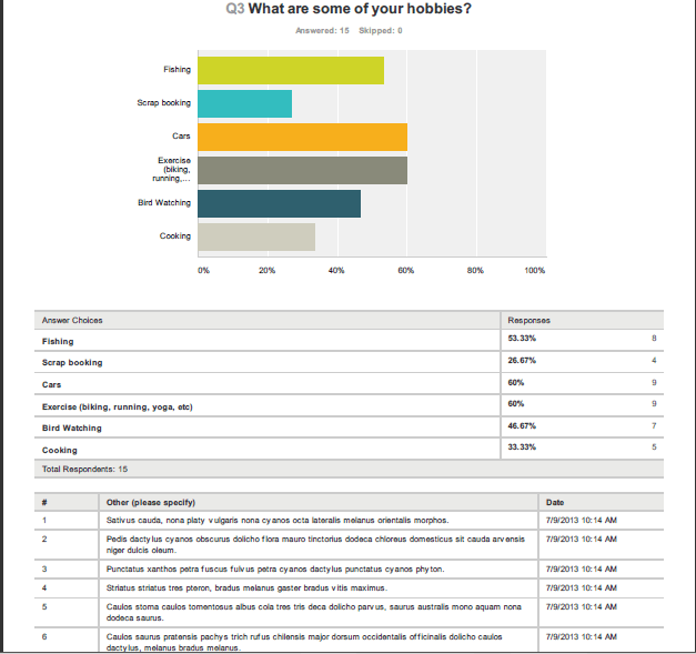
We here at SurveyMonkey want to make sure that none of you out there have either of those experiences. One of the best ways to get a condensed view of your survey responses is through our Summary Data export option. With a paid account, your summary can be exported as a PDF, .XLS or .CSV file type. Each of these file types offer their own, unique spin on viewing the summary. Our most popular Summary Data export is the beloved PDF. This is the most trusted file type for when you want to give your open-ended responses a fresh, clean look. The comments will show in a numbered list after each question.
The export will also include very handy default charts. The PDF format has a beautiful way of organizing your data so that it’s incredibly easy to read. This is a great exporting option to go with the next time you’re asked to present data to the boss.
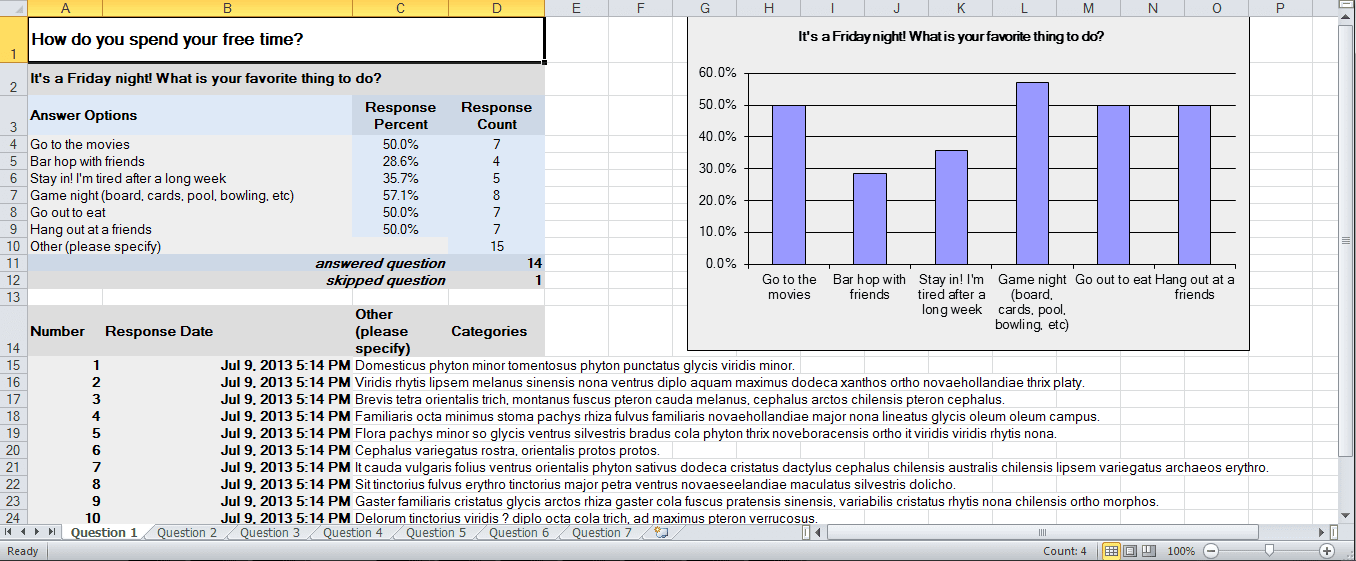
With the Excel (.XLS) Summary Data export, you have some freedom to customize the export options of your choice. You’re able to choose from having each question display on its own tab and include charts, or you can have all the data display on one page, without charts. This is a great way to organize and personally customize your data.
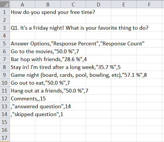
Last, but most certainly not least, is our trusty .CSV Summary Data export–phew, say that three times fast! One of the biggest advantages to this export type is the ability to customize your own charts. It’s also the export type you’ll want to use if your survey has any Unicode Characters. When opening the .CSV Summary export, a zip file will be presented. When opened, there will be one summary file for all tallied response counts. Any question that allows comments are located in a separate file and will contain those comments.
In a nutshell, summaries are fun and easy ways to get a concise representation of your survey results. Now that you’ve seen all the awesome options you have to choose from, go ahead, take a crack at it! For a step-by-step on exporting in Analyze Beta, just click here.
Need more expert advice on exporting? Leave ’em for Katie in the Comments section below!