How to analyze survey data
Discover how to analyze survey data and the best practices to streamline survey analysis in your organization. Learn how to make survey data analysis easy.

The results are back from your online surveys. Now it’s time to analyze survey data and turn data into meaningful information you can act on. This guide follows the full path: clean your survey data, summarize the numbers, connect open-ended feedback, and build a clear story for stakeholders.
In this guide, you’ll discover what survey analysis is, the different types of survey data you can interact with, and seven steps to conducting effective survey data analysis.
What is survey analysis?
Survey analysis is the process of transforming raw survey data into insights you can act on. It focuses on the patterns, trends, and relationships in your responses, using descriptive methods (such as counts, percentages, and averages) and inferential methods (such as correlations and significance tests) to interpret survey results and inform decisions.
Good survey data analysis starts with intention because most surveys blend closed-ended questions with open-ended feedback. Going into survey analysis with a plan—clear goals, a small set of priority questions, and a sense of who needs the findings—makes it easier to decide how to analyze survey results and which outputs matter most.
The different types of survey data
The questions you ask in a survey directly respond to the form of data you receive. Data can either be quantitative or qualitative.
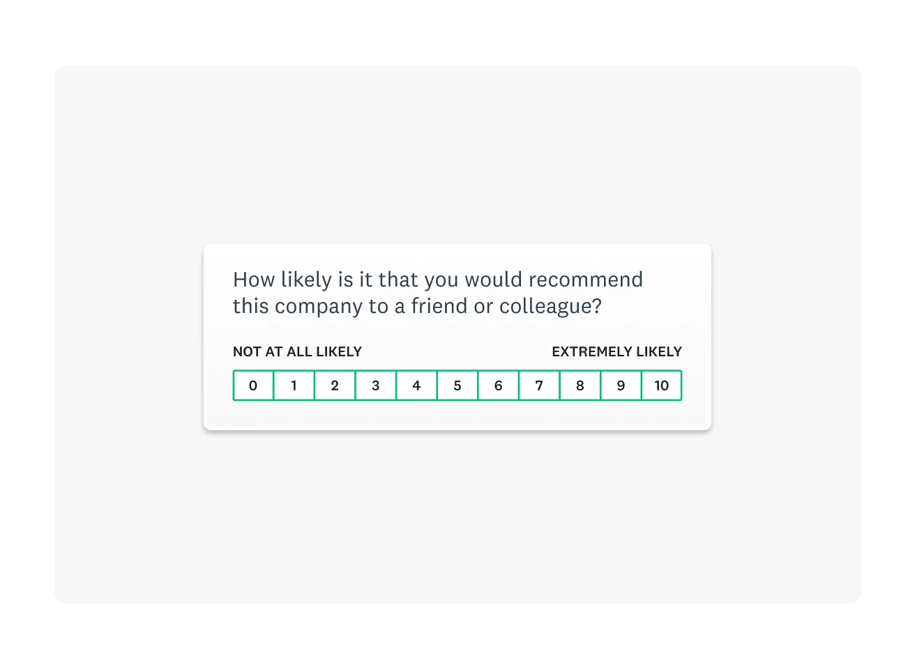
Quantitative data is numerical responses from closed-ended questions. For example, in a Net Promoter Score (NPS®) survey, ratings are on a scale from 0–10, and the numbers can be counted, averaged, and compared across groups or over time.
Sample survey question: “How likely are you to recommend us to a friend or colleague? (0–10)”
Numerical data is fantastic for tracking progress over time. But, if you want insight into why someone responded the way they did, a follow-up question that will yield qualitative data is a great idea.
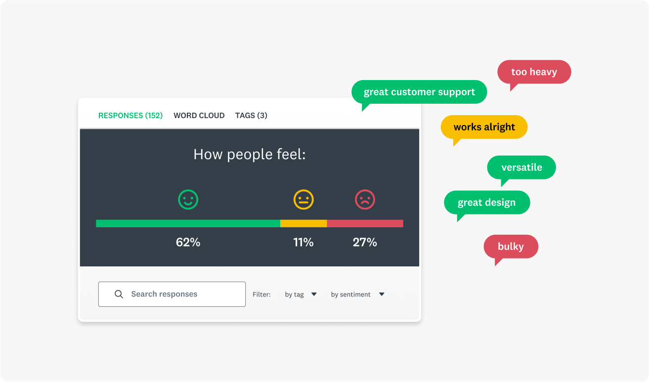
Qualitative data is open-ended responses where people explain their choices in their own words. These answers reveal motivations, pain points, and context behind scores.
Sample survey question: “What is the main reason for your rating?”

How to analyze survey data in 6 steps
When responses start pouring in, it can be hard to know where to begin. These six steps turn survey data analysis into a repeatable workflow. They help you decide what matters most, structure your survey data, and build a story that is accurate, fair, and easy for stakeholders to act on.
1. Clean your data
Before starting with survey analysis, you must ensure your survey data is usable. Cleaning your survey data means deciding which respondents to exclude from your analysis, removing low-quality responses, and eliminating duplicate responses.
Some responses may only have answered a small selection of your total questions, while others may have rushed through your survey without considering their answers. All of these cases would contribute to low-quality data, which may impact the accuracy of your final results.
Conducting a response quality analysis will help you identify survey responses that don’t fit your criteria. For example, if you’re collecting data related to customer sentiment, a response from someone who isn’t a customer wouldn’t be beneficial.
Preparing your survey data for analysis by making it readable, equally formatted, and sorted will give you a clean and clear data set to conduct analysis.
2. Start with your top survey questions
A top survey research question is your guiding force for a survey. These questions relate to your survey research objectives, which you should have made when setting a survey goal.
Before diving into the granular details of your data, begin with your top survey question. For example, if your question was, “Would people be interested in buying this new product?” then the following table of results is where you should begin.
Would you purchase this product if it were available today?
| Answer choices | |||
| Yes | 71% | 852 | |
| No | 18% | 216 | |
| Not sure | 11% | 132 | |
| Total | 1,200 |
As you can see, the vast majority of people responded positively. With that in mind, you can proceed with data from other questions to gather more information about this product.
Broader, top-level survey questions will help you locate primary opinions and ideas within your data. Once you’ve laid this foundation, you can move into more intricate parts of data analysis to respond to your research questions.
3. Slice and dice your data
Often, one of the best ways to better understand data is to break it down. Your business can use cross tabulations (crosstabs) to divide your data into smaller groups based on shared characteristics. For example, you could filter the data by responses from a specific background. You can filter, compare, and create rules to analyze data on each use segment.

Data filters are a powerful way of gaining comprehensive insight into your data. For example, if you wanted to know how a product fared with different groups, you could include demographic questions in your survey. As people choose their age group, you can instantly filter for responses from each group. Comparing these datasets would then show how much each age group likes your product, helping to spot outliers or unhappier demographics instantly.
You could filter by:
- Gender
- Job role
- Age
- Other demographic factors
- Other psychographic factors
While qualitative data doesn’t yield the percentages or raw numbers you can use here, you can always use text analysis tools. By gathering written responses and putting them through one of these tools, you could create a sentiment analysis that shows how your customers feel.
4. Perform a statistical and contextual analysis
Converting raw data into insight involves proving statistical significance. After all, you must ensure your data shows a finding rather than just cherry-picking cases. Statistical analysis reveals whether the trends you observe are meaningful and what the data suggests when used with other datasets.
There are several methods you can use to prove statistical significance:
- Frequency distributions
- T-test
- Analysis of variance test
- Crosstab analysis
- Cluster analysis
- Factor analysis
Beyond raw analysis, other factors determine whether or not you have meaningful results. For example, the total number of responses and completion rates compared to your total sample size will suggest whether or not your results represent a statistically significant group.
Equally, it’s a good idea to consider the margin of error in your survey results. A margin of error reflects how closely your results mirror the entire population. A small margin of error will suggest you have high confidence in the accuracy of your results, while the opposite suggests your results could fail to represent the wider world.
If you need more survey responses to add a level of authority to your survey results, SurveyMonkey Audience has you covered.
5. Benchmark and track your results
Benchmarking is the process of comparing your results to other companies or industry averages. You can even benchmark your results against yourself with repeated survey experiments collecting data over different quarters or years.
Businesses around the globe use customer experience benchmarking to determine how their customers perceive them compared to their competitors.
By conducting a longitudinal analysis, you’ll discover how your survey results have changed over time. For example, if you host an annual conference, you could ask attendees to rate their satisfaction with the event using a conference feedback survey. If the average satisfaction rate decreases over time, you have an interesting entry point for further research.
You could couple the satisfaction question with an open-ended one, asking people to explain their choice. This qualitative data will shed light on what may be causing the decreasing satisfaction, helping you take actionable steps to fix it.
You can even track data for different subgroups. Say, for example, that satisfaction rates are increasing year over year for marketing staff but not for administrators. You might want to look at administrators’ responses to various questions to see if you can understand why they are less satisfied than other attendees.

6. Create and share a compelling report
Your survey data has the power to tell a story. Start with your top research question, outline your findings, and go from there. What did you want to find out? What did you learn from your data? What specific findings stand out or are particularly interesting?
Where possible, use visuals to support your report. Your readers won’t want to move through paragraph after paragraph of written numbers. A simple graph or word could summarize your results and let people intuitively understand what the data is saying.
Now that you’ve analyzed your data and found statistical significance, it’s time to show the world. Creating a great report showcasing your findings is the final step of practical survey analysis. With this report, you can share your findings with colleagues, which can inspire change in your organization.
Related reading: How to use six basic charts to create effective reports
The most common survey analysis mistakes
Even careful teams run into the same pitfalls in survey analysis. These usually fall into two categories: problems that weaken the findings and reporting habits that make results seem stronger or narrower than they really are. Recognizing these patterns makes it easier to spot them early and keep survey data analysis grounded in reality.
Use these patterns as a quick check before you finalize your survey data analysis, so common mistakes don’t slip into your findings or reporting.
Confusing correlation vs. causation
The most prominent mistake people new to research make when conducting survey analysis is confusing correlation with causation. Causation occurs when one factor directly causes another. Correlation, on the other hand, occurs when two factors move together but may not be related.
A great example of this is the effects of cold weather. Drinking hot chocolate and wearing mittens are correlated variables, as they both tend to go up and down together. However, one does not cause the other. They are both caused by a third factor: the cold weather.
Just because two factors move together does not mean they are related. Performing correlation analysis will help you identify the relationships between your data.
You could connect two data pieces with a tertiary motive if you confuse correlation and causation.
Cherry picking data
As we mentioned, you can think of your survey results as telling a story. However, you could be missing the bigger picture when you cherry-pick data, that is, selecting key data points that validate your hypothesis.
When you set out to prove something with a survey, it can be frustrating when your data doesn’t line up. Perhaps some customers simply don’t agree with a key statement, or your data doesn’t show a statistically significant majority. Whatever you encounter, the last thing you should be doing is being hyper-selective about the data points you use.
If you’re having to pick and choose which data to use in your calculations, then you’re undermining the accuracy of your survey results.
Rushing to calculate survey results
SurveyMonkey knows better than anyone that conducting surveys and gathering results can be extremely exciting. That said, when you rush to calculate survey results, you could be overlooking important data that hasn’t yet been filled in.
Surveys often need large pools of responses to increase your level of confidence in the data. If you rush to calculate results as soon as possible, you may have fewer responses than you need to prove statistical significance.
Imagine if your survey results show that 100% of customers are interested in a new product feature. While that sounds amazing, if only one person responded to your survey, how confident can you be that your pool of responses really reflects your wider customer base?
Tips for improving survey data quality
The questions you include in your survey directly respond to the type of data and the quality of the data you receive. With that in mind, your survey data is only as good as your survey questions.
Here are a few tips:
- Collaborate with coworkers: Sharing your surveys with colleagues before publishing them will help you find any issues with your survey. If you’ve written the questions yourself, you may overlook simple problems in the style of questioning you’ve chosen. Collaborate with others to create comprehensive, balanced, and effective surveys.
- Use different question styles: Using both open-ended and closed-ended questions will help you to create a well-balanced survey. When your questions are neutral, simple, easy to understand, and diverse, you’ll receive high-quality data across the board.
- Leverage integrations: By integrating other applications, like your CRM platform, you can automate the integration of survey data into other areas of your business. You can make data analysis even easier when working with other tools, helping to streamline the identification of useful insights.
- Use expert surveys: As the quality of your questions impacts your data, you can always turn to survey templates written by experts to make better surveys. By using these templates, you can increase the likelihood of gathering reliable data.
By enhancing the quality of the surveys you write and send out, you’ll naturally begin to collect higher-quality data.
FAQs
- Q: What is regression analysis?
- Q: What is longitudinal analysis?
- Q: How to determine sample size?
- What’s the fastest way to analyze survey data?
- How many responses are “enough”?
- What statistical test should I use?
Survey research made easy with SurveyMonkey
There are many aspects of survey data analysis, from looking at your top results to slicing and dicing the data to reporting on the results.
SurveyMonkey has survey analysis tools and templates that’ll make it easier than ever to get reliable responses and reach your target audience.
Sign up to use templates and tools created by experts.
NPS, Net Promoter & Net Promoter Score are registered trademarks of Satmetrix Systems, Inc., Bain & Company and Fred Reichheld.