
The further you analyze your survey results, the more insights you’re likely to glean from them.
Cross tabulations (crosstabs) are useful tools for taking a deeper dive into your data. Crosstabs structure your data into a table that groups respondents based on shared background information or survey responses, allowing you to compare each group’s answers to one another. This helps you better understand each group of respondents and uncover how they differ from each other.
While cross tabulations are valuable, it can be a pain to manually create a table and load your survey responses into it before starting your analysis. Luckily, you don’t have to. Our crosstab reports feature (available on paid plans) does it automatically so you can easily compare how multiple groups of respondents answer your questions.
Sound good? Before you jump in and start using crosstab reports, we’ll provide more context around how they work, and offer some best practices for creating and sharing them.
Take your analysis to the next level
Discover all the ways you can use SurveyMonkey to slice and dice your data.
Crosstab report overview
Let’s walk through a cross tabulation example: Say you ran an employee satisfaction survey. You used multiple choice questions to ask your employees how happy they are at work and how long they intend to stay at their job. You also asked them about themselves, including how long they’ve been at your organization and how many hours they work, on average, per day.
The crosstab report you create from these questions might look something like this:
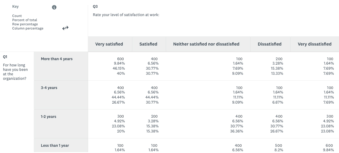
Note: We’ve followed the pattern of a typical crosstab report, where the questions that define the groups occupy the columns and the questions you use to compare the groups are in the rows.
Using our table above, you can see that there appears to be a relationship between employees who’ve been at your organization for a longer period of time and their level of satisfaction. In addition, though it isn’t shown in our image above, the table tells us that work hours appear to have a negative association with the length of time employees plan to stay at your organization.
Note: When analyzing your data you have to be careful about saying one variable directly impacts another. For example, employees who’ve been at your organization for a longer period of time may receive more benefits—leading them to be happier. That being said, identifying associations or relationships between variables is still invaluable, as you can use them to uncover their root causes.
The thing that sets crosstabs apart from other survey analysis tools is that they allow you to compare your results across multiple dimensions, like we did in the crosstab above. For example, compare rules, another survey analysis feature in SurveyMonkey, only allow you to use the responses from a single question as a dimension for comparison. So, in our employee survey, we’d only be able to compare the responses from employees of different tenures or those who work different amounts of time—but not both at the same time.
In short, use a crosstab report when you want to compare your survey results across multiple dimensions or groups.
How to build a crosstab report
You can create a crosstab report in minutes:

1. First, click on the “Present Results” tab at the top of your survey’s homepage.
2. Select the button, “+ New.”
3. Select “Crosstab” from the dropdown menu.
4. Choose the questions that represent the groups or dimensions you’d like to use to compare your results by and drag and drop them into the “Columns” box.
5. Choose the questions you’d like to see comparisons of and drag and drop them into the “Rows” box. Once you’ve finished, hit “Next.”
6. Select “Create crosstab report.”
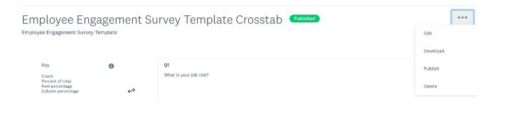
7. You should now see your cross tabulation table. You can edit, download, publish, or delete it by clicking on the three periods at the top right of the table.
8. To share it, you can either download the CSV of the data, or publish it and then access a shareable link by toggling on “Link Sharing.”
To learn more about any of these steps, visit our help center article.
3 tips for creating a great crosstab report
Before you begin building out your crosstab report, ensure that it looks the way you want by following these best practices:
- Narrow down the questions you want in your report. Choosing one too many questions can lead to a crowded cross tabulation table that makes the more valuable insights less visible.
We’ve tried to prevent this issue by limiting the number of questions you can add, both to the columns (5 questions) and rows (10 questions), but even approaching these limits can result in an overwhelming table.
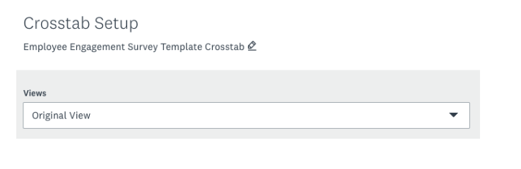
- Apply filters to home in on the audience you care about most. You can create and save views for any combination of filters you use in Analyze. You can then access any filtered views in your “Crosstab Setup.”
- Find out if your results are statistically significant. SurveyMonkey crosstab reports automatically highlight statistically significant differences in your results as blue. A statistically significant difference means the result is unlikely due to random chance. If you’re running a serious or important survey you’ll want to make sure your results are statistically significant.
Need help getting responses?
Use SurveyMonkey Audience to collect feedback from your target audience.
The last step: Sharing your crosstab report
Once your crosstab report is all finished, you’re ready to share it with the people who need it! Decide whether to download the report as a CSV file or share the link to it by considering each option’s pros and cons.
Sharing the link:
Pros
- More control over who can see it and when—as you can always shut down access by clicking on the “Link sharing” toggle.
- Automatically updates when new responses come in
Cons
- The report is static, which means you can’t manipulate the data
- Closing the report at a time that works for everyone may prove difficult
Downloading the CSV:
Pros
- Easy to manipulate the results to uncover additional insights
- Those who receive the data don’t have to worry about losing it
Cons
- Less control over data (once you share it, you can only hope it gets used responsibly)
- Doesn’t automatically update when new responses come in
A cross tabulation can help you uncover hidden relationships between different variables in your survey data, which in turn help you make better decisions. The insights you’re able to glean—and the resulting decisions you’re able to make—only improve when you analyze several crosstabs in your report.