Exciting news! We’re delighted to introduce our brand new feature to help you analyze your results–Data Trends. With the new Data Trends feature, you can compare the answers to your surveys over time, allowing you to answer questions like:
- Has my customers’ satisfaction with my product changed over time?
- Have the changes we’ve made led to any improvement in employee satisfaction?
- How do the reviews for this year’s event compare to last year’s?
On the Data Trends tab, you will get a chart of trended data for each Multiple Choice, Rating Scale, or Matrix question in your survey. (We don’t currently include any trended data for open-ended questions.) Now you can really dig into changes to your results over time. For example, take a look at this Data Trends chart.
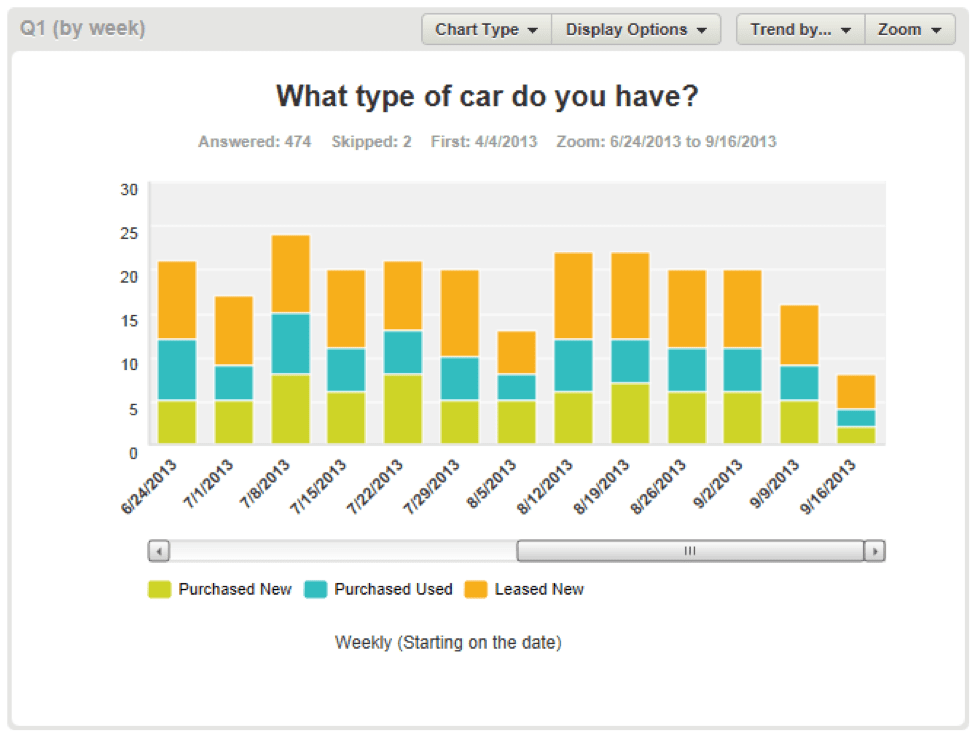
Without having to build any filters or export any data for further analysis, now you can see a clear trend in the data. You can also tell how many people answered the question each week, and instantly see any trends in how the answers are changing. There are many ways to configure your Data Trends charts to get to exactly the insights you need. Note the Trend by… and Zoom buttons at the top of each chart. These are the controls for customizing your chart’s timeframe and the amount of detail. Using the Trend control, you can see how your respondents’ answers have changed each day, week, month, quarter or even year (depending on how long your survey has been running).

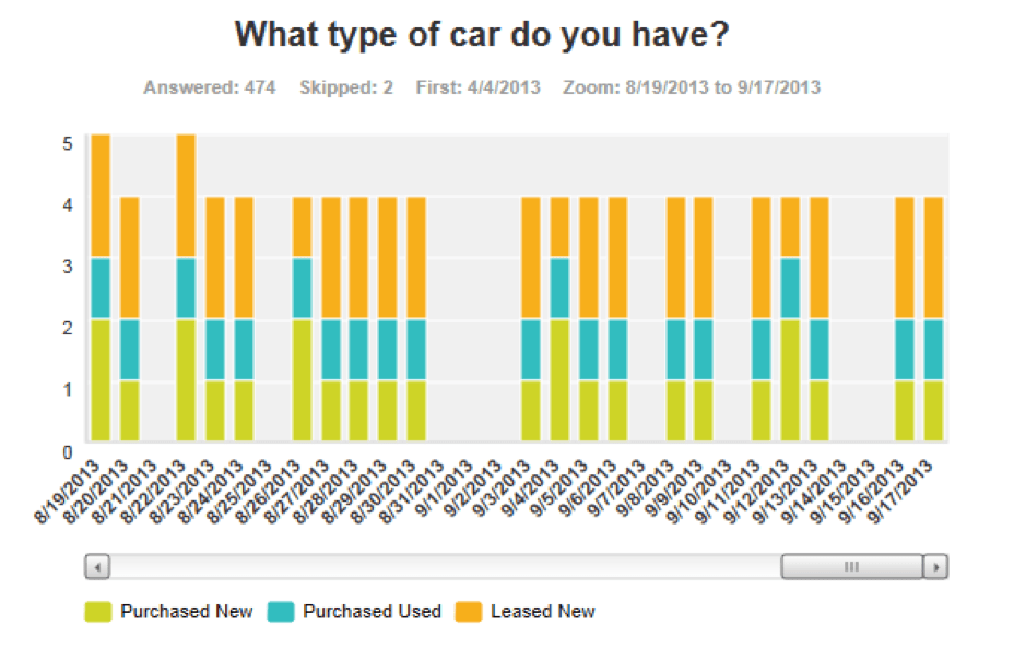
The Zoom control allows you to change the start and end dates of your chart, either to see more time on a single chart or to zoom in for a detailed view of a shorter period of time. For example, in the chart below, we’ve zoomed in to just the last 30 days of survey results and used the Trend control to view the data by day instead of by week. (Even though the chart only shows 30 days of data, the scrollbar beneath the chart shows you all of your data from the first response to the last.)
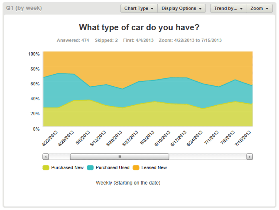
Of course, often the trend is difficult to spot due to differences in the number of responses that come in. But in the Display Options menu, we have an option to display your chart as a percent of the total responses for that time period, instead of the absolute number. This will smooth out the differences in response volume over time, so you can get right to the changes in the answers. The chart type menu also allows you to change between bar charts, line charts, and area charts. For example, here we’ve displayed a weekly chart in percentages instead of absolute numbers and changed it to an area chart. Go ahead and try out the new Data Trends feature now. It’ll be available for all of your surveys. (Note: Data Trends is only available in certain SurveyMonkey plans, so take a look and find the one that’s right for you.)
Just look for the Data Trends tab between the Question Summaries and Individual Responses tabs at the top of the page, above your results. Don’t forget, this exciting new feature and others are exclusively available in our new Analyze tool. Still, viewing your survey data in our Classic Analyze and want to get in with the new? Sure you do!
Questions? Comments for Josh? You know where to go.