Here at SurveyMonkey, our goal isn’t just to give you the results to your survey. We want to help you understand them so that you can make better decisions.
Sometimes, just looking at a data table or a bar chart won’t reveal the whole story behind your data. The task gets even harder if you have a lot of answer options in your question, or if you’re trying to compare the results for one group of respondents against another.
This is where survey statistics can help. Survey statistics are data points that summarize individual survey responses into actionable and meaningful results. For example, it can be the percentage of employees who love working at your company or the average amount of money potential customers would pay for your product.
To get the benefits of using survey statistics on your surveys, we’ll introduce you to our Basic Statistics feature.
You can access the feature by using any of our multiple choice questions, including the matrix/rating scale question type. Once your responses come back, you’ll be able to see the mean, median, maximum, minimum, and standard deviation alongside your results.
So let’s take a look at the numbers included in Basic Statistics, determine what those numbers mean, and learn how to display them alongside your survey responses.
Basic Statistics: Getting started
As an example, let’s say you’ve asked your audience about their satisfaction with your business using a Likert Scale question from the SurveyMonkey Question Bank. When you go to Analyze, the results look like this:


Though you can see that there were a lot of diverse responses, and you know the exact number of responses for each answer option, can you easily tell what the overall answer to this question is? Probably not.
This is the right opportunity to use Basic Statistics. To turn on the feature, use the standard customization features for your question (Click the Customize button at the top right of the question.).
On the Display Options tab, you’ll find a set of checkboxes listed under Show. When you see the checkbox for Basic Statistics, click it. By checking it off and then clicking Save, you'll see a new table displayed
in the response data table for your question.
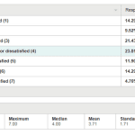
Following the example, here’s what the results look like:
What does each of these survey stats tell you?
The table includes the minimum, maximum, median, mean, and standard deviation, based on the question’s responses. To help you understand the statistics, you assign a number to each answer option and display those in parentheses next to the labels.
The minimum and maximum show the lowest and highest numbered answer options that receive at least one response. (In the example above, the min and max of 1 and 7 show that there were 6 responses in the top answer—Extremely satisfied—and 2 responses in the bottom answer—Extremely dissatisfied.) This can be helpful to quickly see the range of your answers.
Median and mean give you a quick summary of your results. Using the numbers assigned to the answer options, the mean gives the average of all your responses. The median represents the answer option in the middle of all your responses, meaning there's an equal number of responses above and below that answer option.
In this case, a mean of 3.71 shows that overall, your respondents came in somewhere between “Somewhat satisfied,” and the neutral—“Neither satisfied nor dissatisfied” option. However, there’s some nuance to the numbers mean and median provide.
The median of 4 shows that the answers are about evenly distributed between positive (more satisfied) and negative (less satisfied) responses. A slightly lower mean signifies that there were more respondents who were extremely satisfied than respondents who were extremely dissatisfied.
Finally, the standard deviation shows the spread or variation of your responses. The higher your standard deviation, the greater your variance—meaning, the further your responses are from the mean (average) of your results.
In the example, you have a standard deviation of 1.71, which means that 68% of the responses are plus or minus 1.71 from the mean. With this information, you can expect 68% of the responses to be between 2 and 5.4.
Generally speaking, numbers within one standard deviation of the mean will encompass 68% of the respondents and numbers within two standard deviations of the mean will encompass 96% of the respondents. So, if you have a small standard deviation, more of your responses will be clustered around the mean. While a large standard deviation indicates that your responses are more spread out.
Running a test experiment? Whatever AB test you run, you can measure its statistical significance in a matter of clicks with our calculator.
Basic Statistics + Compare = awesome data analysis
Understand your survey results even better
by using Compare rules. The feature allows you to view results across different respondent groups.
For example, let’s say you asked respondents about their gender in your survey. Now you can set up a Compare rule to see the differences in results for female vs. male respondents. When you turn on Compare, you'll now see a Basic Statistics data table that looks like this:
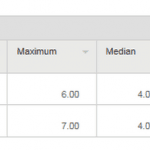
In this example, the responses between men and women are not much different, but you can quickly see that:
- The maximum is different. None of the female respondents answered Extremely dissatisfied
- While the median and mean are almost identical, the standard deviation is more than twice as high for men. This means that men and women felt the same way overall, but the female responses were all bunched around the mean responses (neutral) while the male responses were spread more to the extremes of the answer options
Basic Statistics are also very useful for understanding numerical responses. To see the feature for a numerical question, you need to use the Multiple Textbox question type when creating your survey, and check the checkbox for Only Allow Numerical Data.
For example, let’s say you wanted to know how many times your respondents had seen two movies (Star Wars and Twilight). Your results look like this:
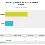
Clearly, your respondents have seen Star Wars more than Twilight, but that’s about all you know. However, if you turn on Basic Statistics for the question, you also get this data:
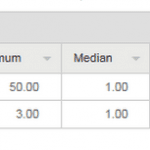
Now you can see that the mean is much higher for Star Wars than for Twilight while the median is the same (1). That means that the people who have seen Star Wars more than once have seen it more times than the people who have seen Twilight more than once.
Sure enough, when you look at the maximum for each movie, you can see that at least one person has seen Star Wars 50 times, while no one has seen Twilight more than 3 times.
If you compare the answers for men and women, you get even more detail:
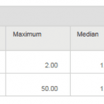
Now you can see that the difference between Star Wars and Twilight came from your male respondents (female respondents have only seen Star Wars 0, 1, or 2 times.).
Basic Statistics help you understand your results faster and more fully. So sit back, relax, and let us do the math for you. You’ll have more robust analysis to include in your reports that ultimately help you make better decisions.
Want more tips for analyzing your survey results? Learn a variety of best practices with our guide: “7 filtering techniques for getting better data.”


