As promised, we’re back to share more exciting new features in our Analyze tool with all of you! How many of you survey fans out there love charts? How about color-customization? Oh, it’s all of you? That’s what we thought.
Now, it’s easier than ever to apply and preview changes to your charts before saving them. Plus, you can now select the colors of your charts as well as make changes to them at the same time. So without further ado, allow us to walk you through our latest product upgrade in Analyze.
To get to all the options, we’ve replaced the Chart Type and Display Options buttons with a single Customize button. (See the red #1 arrow in the picture below.) Clicking Customize will slide your chart down and show you all the controls to customize your chart. Did you know you can also sort the answer options in both your charts and data tables? By clicking on the small arrow in each column header of your data table (see the red #2 arrow), you get the option to sort by the answer text or by the number of responses each option received.
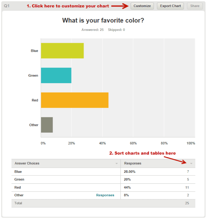
Let’s make some changes to the chart in this example. The answers are “blue,” “red” and “green,” but they’re currently displaying in green, teal and orange. That’s going to be a little confusing so let’s change the colors in the chart. We also want to make this a pie chart.
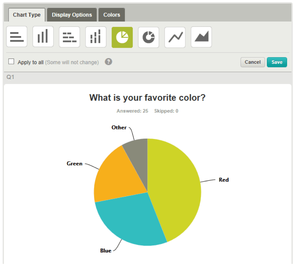
Clicking the Customize button will open the customize interface. Notice there are now three tabs at the top: Chart Type, Display Options, and Colors.
Pro Tip: You can also open the chart customization interface by clicking directly on a colored bar or pie slice in your chart and selecting a customization option from the menu that will appear.
In the example shown below, we’ve clicked to change the chart to a pie chart. You’ll notice that your changes are instantly reflected in your chart. That way, you can preview changes and decide whether or not to save the changes. Pretty cool, right?
Now on to the fun part–let’s switch up the color scheme, shall we? Clicking on the Colors tab will open the color customization interface. You’ll see the entire palette currently being used.
Pro Tip: Even though in this chart there are only four answer options, we have a set of 10 colors by default in the palette. Colors are used in order of answer options. If you have more than 10 answer options then the colors will repeat, unless you add more colors to your palette.
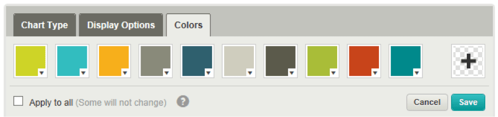
There are a few ways you can change the colors in your charts. You can simply reorder the colors that are already available for the chart. Do that by dragging-and-dropping the color squares to the positions you want.
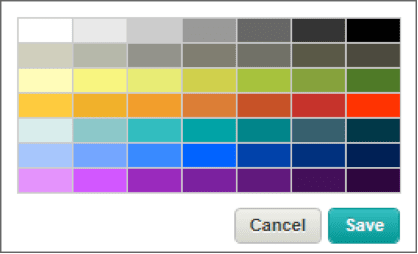
If you want a completely new color, just click on the color square. You’ll get a menu that allows you to edit, copy, or delete the color (only if you have more than 10 colors already). Selecting Edit color will open up a popup with a set of new colors to choose from. Just click on the color you like and then click Save. Editing colors is a feature only available to our Pro customers, so if you’re on a Basic plan, you’ll need to upgrade in order to change the colors in your charts.
So let’s edit the colors for the first three answer options to make them correspond to the answer options “red,” “blue” and “green.” Voila! Our chart looks just the way we want it.

Last but not least, we’ve added a feature that easily lets you make changes to all of your charts at the same time. This saves the time of you having to customize the chart for every question in your survey.
So did you notice the checkbox that says Apply to all? Psst, it’s right under the colors in the picture above. By checking that box before you click Save, all the changes you made to that chart will be applied (if possible) to every single chart in your survey.
For example, if we click Save with the Apply to all box checked, SurveyMonkey will turn all of our charts into pie charts and all charts will start with the colors red, blue, and green, as shown above.
Pro Tip: Some of the display options and chart types don’t apply to all question types, i.e. pie charts are not available with matrix question types or drop-down menu question types. Colors, however, will always be applied to all questions.
You can even go into the Display Options tab and change the option to either hide all of your data tables and show only charts, or vice versa, then apply that to all questions in your survey. Once you’ve customized all your charts to look just the way you want them, you can export the charts to PNG files and use them in other documents, or export your entire survey in a PDF to share it with others.
There you have it, folks. We hope you enjoy this latest upgrade to Analyze. Now get out there and start customizing!
Questions for Josh? Leave them for him in the Comments section below.