
Imagine that you’ve finished collecting survey responses from the questionnaire you sent out last week.
As you look at your responses, you get rattled. In a matter of two days, you’ll be presenting this data. How should you make the trends, patterns, and findings in your data clear and easy to interpret?
Thankfully, you can rely on charts to help visualize your data in a way your team will understand.
Before you begin, it’s important to know which chart to use and why you should use it. Also, it’s a good idea to think about how to optimize the format of your survey so that you’re able to create the right type of chart for the right situation.
We’ve made this handy guide to help you understand when and how to use some of the most popular chart types.
Bar charts
Bar charts are our most popular chart for a reason. They allow you to compare the differences in how people answered a question using bars that either appear vertical, horizontal, or even stacked on top of one another.
When should you use bar charts? Here’s a quick look at some of their strengths and weaknesses.
| Strengths | Weaknesses |
| Their simple format makes it easy to compare responses from different answer options. | When there are too many bars, the chart becomes complex and difficult to read. |
| Easily understood given its widespread use. | Sneaky presenters can manipulate the scale of the chart to make it misleading. |
The process of creating a bar chart—or any chart for that matter—begins with the specific question type you choose in your questionnaire.
If you’re creating a bar chart, make sure to use a closed-ended question—a question type with a defined set of answer options to choose from.
Closed-ended questions make up nearly all of the question formats we offer, including:
You can also create bar charts from star rating or ranking question types, but it would probably defeat the purpose of using them in the first place. For example, imagine you were looking at how people rated a restaurant using a star rating question. An average score, or number of stars, is a whole lot more valuable than a chart that shows the actual distribution of responses.
So how do you format a closed-ended question in a way that creates an engaging and visually appealing bar graph? Here are some quick tips:
- Keep in mind that if you use an “Other: please specify” answer option, your bar graph will literally say “Other: please specify” and not the actual response people wrote in
- There’s a sweet spot for the number of answer options to use on charts with vertical bars, generally it’s 4 to 6. If you use less, your chart may look a little sparse. If you use more, a bar chart with horizontal bars will be easier to read
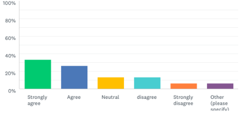
To help illustrate our points so far, check out the following question and its corresponding bar charts below:
“I am happy.” (select one answer)
- Strongly agree
- Agree
- Neutral
- Disagree
- Strongly disagree
Here’s how the results are displayed using vertical bars (default):
Here’s how they look with horizontal bars:
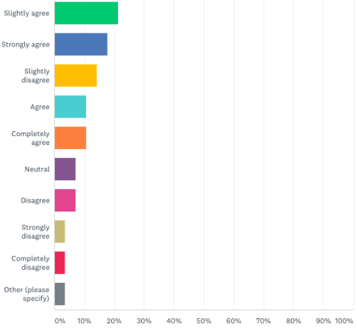
You’ll notice that we added a few more bars to the latter chart. Even at 10 bars, the horizontal bar chart can keep your results relatively clear and easy to understand.
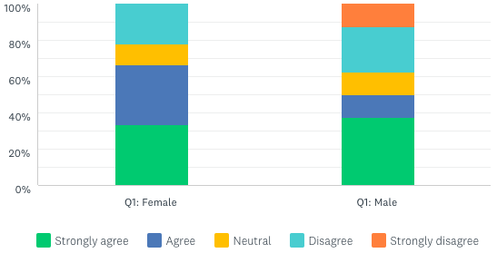
And here’s how it looks with stacked bars, which can either be horizontal or vertical facing.
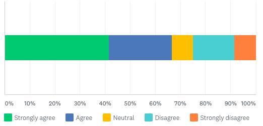
Use stacked bar charts if you want to compare how different groups answer a particular question. In the graph below, we’re able to easily see how the distribution of happy males and females is different. In SurveyMonkey’s Analyze tool, you most often see this chart type when using compare rules to see how different groups of respondents answered a question.
Want to use filters and cross-tabs to take a closer look at your data? Make sure you’ve got the right plan to do it. Learn more →
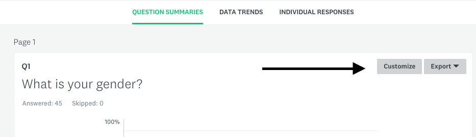
To view a specific bar chart in the SurveyMonkey Analyze tool, follow these steps:
1) Open the survey you want to look at and click “Analyze Results.”
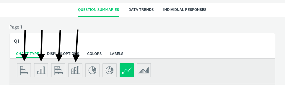
2) Make sure that you’re on the “Question Summaries” tab. For the question you’re hoping to create a chart from, click “Customize.”
3) You can now select whichever bar chart you’d like to use. If you’d like all of the other questions to display the same type of chart, click the checkbox for “Apply to all.” After you’re done, click “Save.”
Pie charts / donut charts
These charts allow the viewer to easily compare answer options (in the form of slices), both against each other and to the whole.
Here are some of the advantages and disadvantages of using pie and donut charts:
| Advantages | Disadvantages |
| They clearly display the share of respondents who selected each answer option. | They can become messy and hard to interpret when comparing more than 5 categories. |
| It’s a snapshot. You can easily compare it to other pie charts to identify trends or patterns. | The trouble with snapshots is that to see trends, you must use multiple pie charts. |
In order to create either a pie or donut chart, use a closed-ended question with a single answer. After all, if the respondent could select multiple answers, adding up each slice could easily exceed 100%.
As you review the closed-ended single answer question types you’d like to use, keep in mind that certain formats result in less valuable pie or donut charts. As mentioned earlier, star rating question types should only be viewed as stand-alone numerical averages.
Dropdown questions are almost always used when there are many answer options. If respondents are allowed to choose from many answer options the resulting pie chart would be crowded and overwhelming.
Here are some additional best practices for creating a compelling pie or donut chart:
- Consider the “Other: please specify” answer choice. Similar to bar charts, when a respondent selects this choice the slice grows but it doesn’t include the specific answer the respondent wrote in
- Try using relatively few answer choices—between 3 and 6 choices usually works well. There’s a balance between making your chart meaningful and overwhelming
Pro tip: If you need to use 6+ answer options in a question but want to create a pie chart from its results, you can combine several of the answer choices. This lets you collect the data you need while creating a chart that’s more visually appealing and easy to interpret.
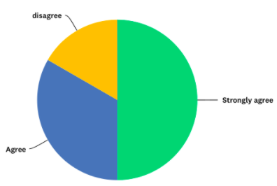
Since the example question from the bar chart section only requires one answer, it can also give us the following donut chart:
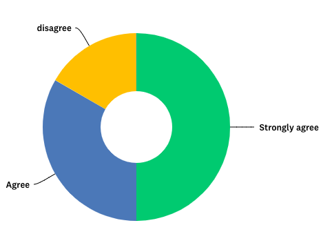
Or it can give us the following pie chart:
To view a pie or donut chart from a question, simply follow the same steps as you would to view a bar chart, but now click on one of the following two diagrams:
Line graph / area graph
A line graph is made up of points that correspond to a particular value of an answer option with lines that connect each value. An area graph is simply a line graph where the area beneath it is shaded. Both of these graphs are relatively less popular options but can still be valuable when used under the right circumstances.
Here are some of the graphs’ relative advantages and disadvantages:
| Advantages | Disadvantages |
| Effectively tracks how the data changes over time, especially when there many data points. | If there aren’t enough data points, a line graph can appear to show misleading trends. |
To create either one of these charts, simply use a closed-ended question and try out these tips:
- Look at using numerical answer choices—anything that measures time often works best
- Avoid using an “Other: please specify” choice. This answer option won’t make sense in the context of a line graph
Pro tip: Both line and area graphs work great in tracking the number of responses that come in over time—whether you’d like to measure time by hours, days, or weeks.
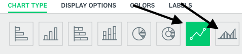
To access this view:
- Open the survey you want to look at and click “Analyze Results.”
- Click on “Data Trends.”
- Find “Chart Type” and select either the line or area graph diagram.
- Select “Trend by…” and choose the time scale you’d like to use.
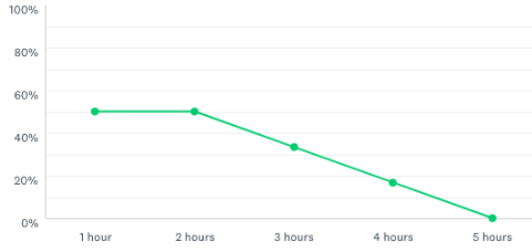
Here’s an example of a line graph:
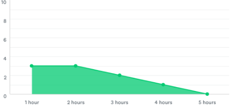
And an area graph:
To create either a line or area graph, simply follow the same steps as you would to view a bar chart, and then click on the appropriate diagram and hit “Save.”
Two easy tips for improving your charts
Once your charts are created, here are two quick things you can do to make each of them more clear and appealing:
- Add the data points onto the charts. This removes any ambiguity in the data and allows viewers to understand your results more quickly.
- Remove decimal points that are unnecessary. It’s important that your charts are kept concise and clean whenever possible.
To complete either of these steps and to find more tips, check out our “Customizing Charts and Data Tables” page.
Conclusion
Each type of chart offers a unique set of benefits for analyzing your results. To get the most use out of them in your survey analysis, start by deciding on the charts you’d like to leverage for each question. From there, format each of those questions appropriately using the guidance in this article.
And now that your responses are in, it’s time to use the right charts to uncover key findings. The presentation to your team couldn’t come soon enough.