Concept testing is incredibly powerful across the entire product lifecycle. It can ensure your concepts are taken to market successfully, no matter if it’s an ad, logo, product, video, or anything else. At SurveyMonkey, we truly believe in concept testing and we value the testing methodologies behind getting our own ideas vetted by a larger audience.
Earlier this year, we conducted a very large-scale brand campaign. We have more than 20 years of survey experience in the bag, and tens of millions of people have taken or sent a survey using our platform. But our previous market research showed that people were unaware of our platform’s robust capabilities, powerful enough for multi-user teams and enterprise.
Our brand campaign was a way to re-introduce SurveyMonkey as a business solution and enterprise-grade survey platform that helps organizations turn feedback into action that drives growth and innovation. We chose to test our ideas first to remove any guesswork from launching the most effective ads, designed to convey that SurveyMonkey is for business.
Here’s how we designed the test, in addition to the quantitative and qualitative results that helped us launch a multi-channel brand campaign confidently.
Need to improve campaign performance?
Discover how concept testing and agile market research can help reshape your marketing campaigns.
Getting the right methodology for ad creative analysis
We started our brand campaign journey with a hypothesis that a multi-channel campaign would help us successfully reach business professionals who could most benefit from our products. In our concept testing, we set our target audience as business decision-makers, but we also used demographic data to understand whether they were also urban residents/workers, their job titles, and industries they worked in.
We had data that told us out-of-home marketing would provide us the best reach for our target audience. But we needed to ensure we were using the right creative before setting it live on highly-trafficked San Francisco city buses and local billboards.
There are three common ways to set up a concept testing survey: monadic, sequential monadic, and forced choice. Monadic design is the most trustworthy and methodological way to design concept testing surveys because it randomly shows each respondent only one of the testing concepts at a time.
Using the built-in monadic methodology within our new suite of Market Research Solutions (available soon), we set up an ad creative analysis. We began with SurveyMonkey Audience, which helps you target your audience and guarantees high-quality responses from millions of qualified people around the world. SurveyMonkey Audience allowed us to choose from more than 50 demographic parameters to reach our audience, such as professionals living/working in San Francisco.
So, we know who we’re advertising to and the type of ad placements, but how do we determine what type of ad creative will resonate with our target market?
Looking for attributes that to help measure ad creative
Part of any concept testing process is defining what attributes you want to test. For our brand campaign, we wanted to look at business relevance. We were able to choose from more than 15 attributes—those that helped shed light on market fit, impressions and feelings, and quality of information. We tested 11 standard attributes including:
- Overall appeal - What is your overall impression of the ad?
- Persuasiveness - How likely would you be to visit the company’s website and find out more?
- Recall - What was the name of the product that was mentioned in the ad?
- Professionalism - How professional is the product in the ad?
- Eye-catching - How eye-catching is the ad?
We also added our own custom attribute to help us determine if our ad concepts conveyed that SurveyMonkey is for business.
- Business helpfulness - How believable is it to you that the product in the ad is designed to help businesses?
Once we set up the attributes to test, we were ready to upload versions of our ad creative and start fielding responses.
Learning actionable insights about our ad concepts in less than a day
Like most marketing campaigns, we were pressed for time on our brand campaign. But lucky for us, Market Research Solutions enables us to outline requirements for our target audience, set up the ad creative analysis survey, and field responses in less than two days.
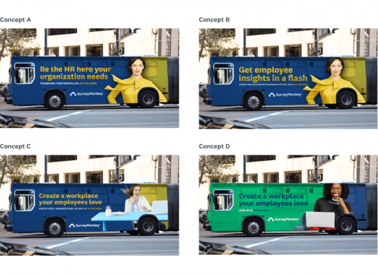
Ad creative analysis helped us determine which colors and messages were most effective for our brand campaign, allowing us to quickly launch the campaign with confidence. We included four variations in the test. Those included two different colored bus ads—green and blue—and three different benefit statements:
- “Be the HR hero your organization needs.”
- “Create a workplace your employees love.”
- “Get employee insights in a flash.”

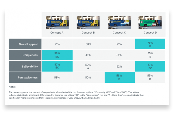
Results showed that all four variations were effective in catching people’s attention and getting our message across. More than 60% of the respondents found the ads eye-catching and more than 50% said they were likely to find out more about the product. Among the people who were intrigued to find out more, the majority of them believed that the product was designed for business. Thus, we concluded that the results were promising.
However, people couldn’t seem to remember the name of the product. That was telling for us—how could we ensure our next iteration of our bus ad was memorable and so very clearly SurveyMonkey?
We also discovered that the word “hero” in the first ad was inspiring to respondents. People reacted more positively to the green-colored ad than the blue, which was comparing concepts C and D. This surprised us. In the past, research led us to believe that the color blue was a better fit for our business solutions. Concept testing results were now telling us that people liked the green color.

We used this moment to take pause and iterate on our designs, so we could put our ad concepts through round two of testing.
Round 2: Fine tuning our creative for a better market fit
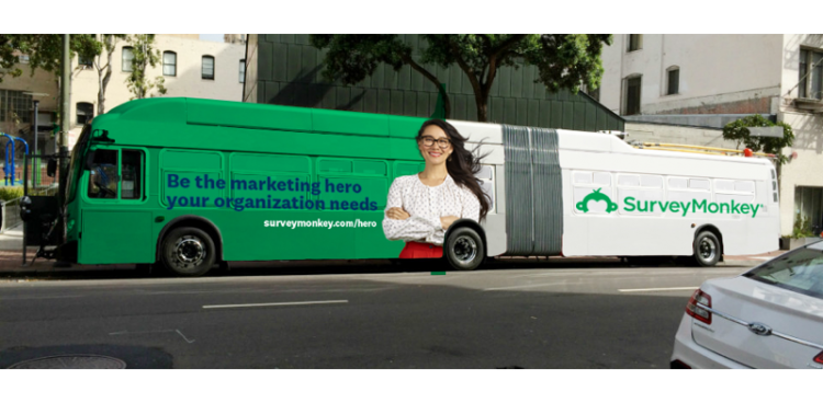
Our first round of concept testing gave us some clarity. Based on the attribute scoring and qualitative feedback, we were confident that our target audience was more receptive to personal benefit statements versus organizational ones. In round two, we zeroed in closely on which personal benefit statement was best. We landed on the “hero” message, which communicated that survey data could empower you in your job.
We also made additional changes. For example, to ensure respondents would remember the name of our product, we increased the size of the SurveyMonkey brand name and logo to make them more noticeable.
We wanted to narrow down the right combination of color and messaging for our target audience. As such, we duplicated the previous ad creative analysis with the same target audience and test attributes. But this time, we tested two ads including the word “hero,” one in blue and green. Two more ads included our other generic business messaging, also in both colors.
Driving toward a clear winner for our bus ads
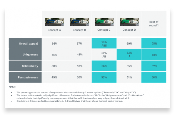
Our attribute scorecards the second time around proved that the combination of green color and “hero” messaging was a clear winner. This ad consistently rated the highest for all attributes and most of the differences were statistically significant. When asked how they felt about the value prop, respondents who received the “hero” version reacted more positively. The qualitative results offered impressions like “bold,” “fresh,” and “eye-catching.” In other words, exactly the effect we wanted our ad to have on people.

By enlarging our logo in our second round of testing, we also found that brand name recall improved by 20%, regardless of the different variations people saw. Concept testing helped us work more agilely, so we could make the right adjustments to our ad creative before launch. Iterating between rounds one and two of testing helped us improve brand recall.

Concept testing helped us resolve open questions about which colors and messages would resonate more with our target market. And it helped us quickly spin up more creative for our campaign confidently. Based on our findings, we’ve since ran creative across a variety of out-of-home placements, including cabs in London and video ads in Times Square, New York.
Have you seen one of these ads? Give us a shout on social media to let us know!


